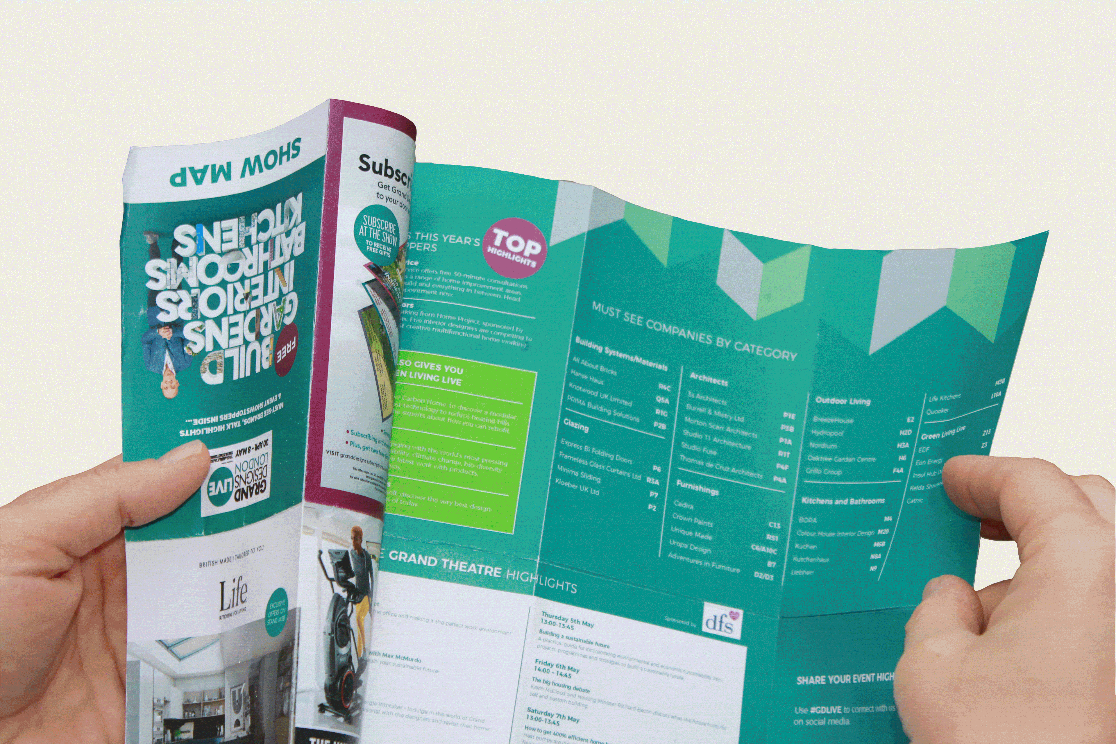
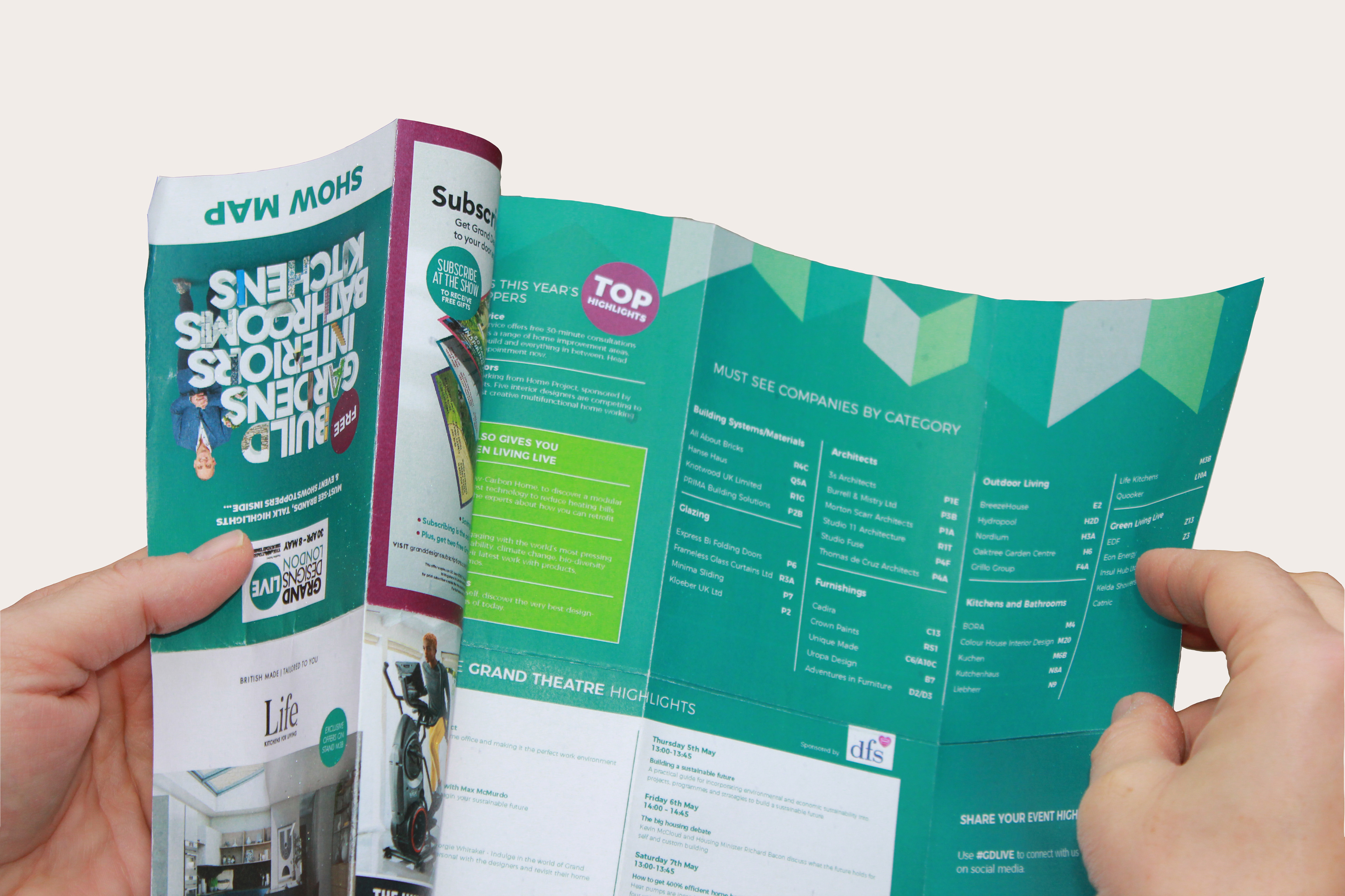
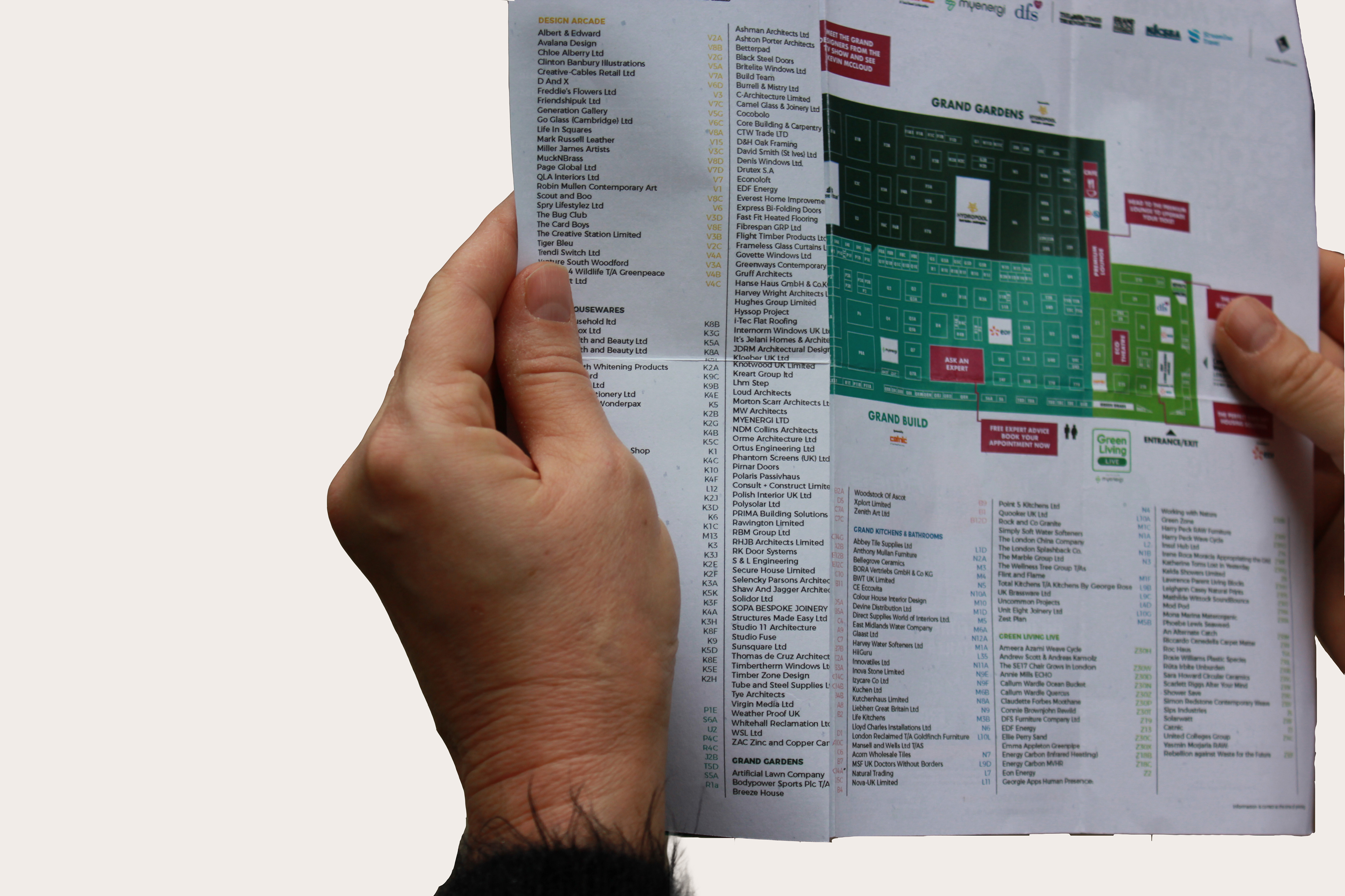
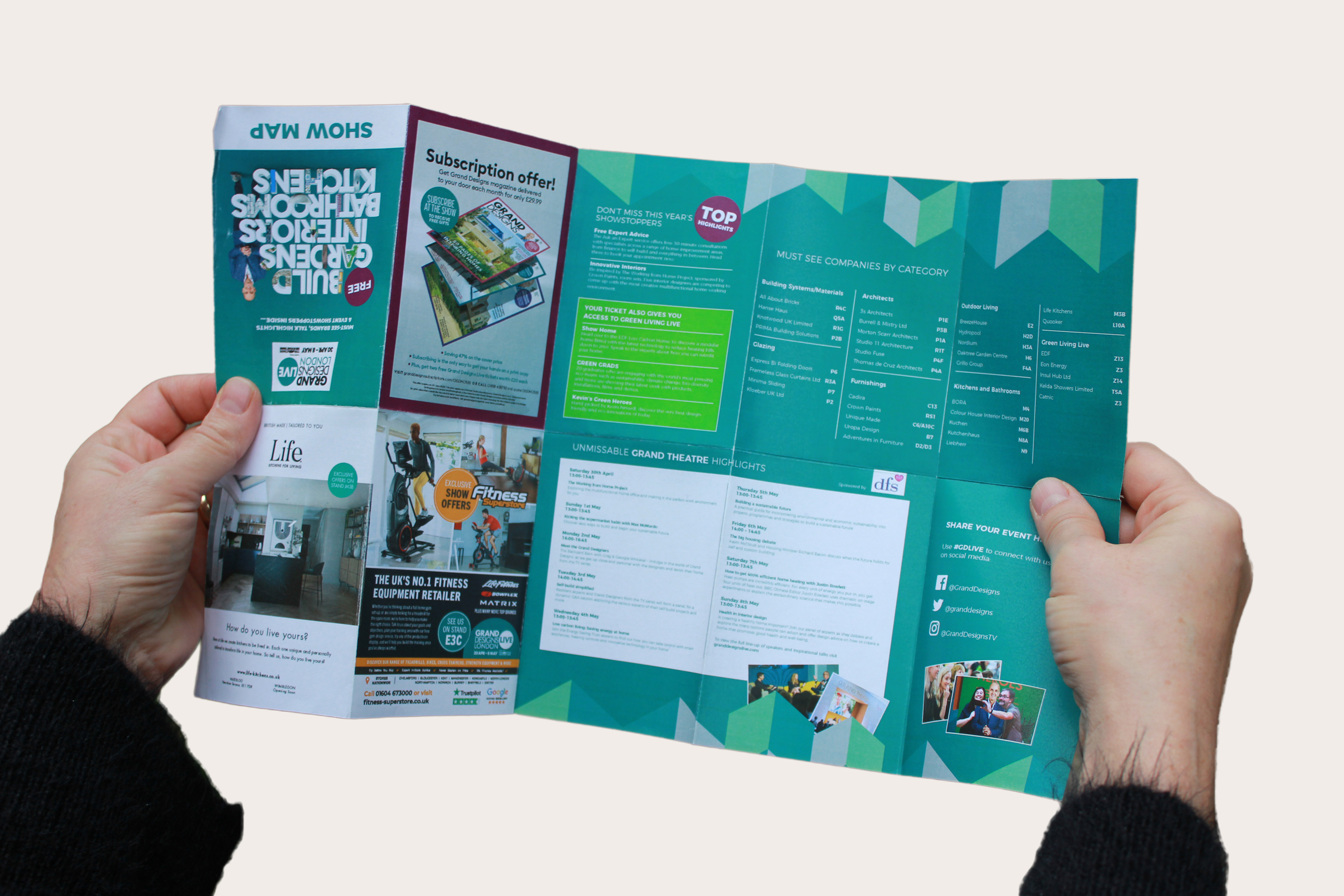
As part of Grand Designs Live, this folded show guide was developed to help visitors easily navigate the venue, explore various zones, and locate their chosen brands and talks at a glance. This piece had to work hard—both as a promotional print and a real-time navigation tool. With hundreds of exhibitors and multiple zones, the challenge was to distil complex spatial and categorical information into a clear, intuitive, and visually cohesive format that could be understood in motion.
I approached the layout with a user-centred mindset, focusing on legibility, wayfinding clarity, and visual hierarchy. The result is a compact, folded design that opens into a comprehensive, map-led experience enhanced with consistent typographic structure and dynamic use of colour blocking to guide the eye. The design needed to stay aligned with the Grand Designs brand, while also improving the flow and feel of the visitor experience on-site.
ZONE-BASED COLOUR SYSTEM
Each area of the exhibition was colour-coded to match its respective thematic zone: Grand Gardens, Build, Interiors, Kitchens & Bathrooms, etc. I introduced a bold, intuitive colour system to help readers quickly identify sections, even when the map was partially folded. These colour blocks, repeated in the brand legend and index, created a self-reinforcing navigational language that made the physical layout easier to understand on the go.
TYPOGRAPHIC HIERARCHY & FLOW
The typography was set up to facilitate instant skimming: clear headers for each zone, legible lists of brands, and condensed type for tighter information areas without losing clarity. Careful spacing and alignment decisions helped anchor the chaos of hundreds of exhibitors into a calm, readable rhythm. The index layout was particularly considered, balancing density with digestibility.

PHYSICALITY & FUNCTION
This guide was printed on durable stock with folds optimised for fast reference—easy to open fully and collapse again without awkward re-folding. The tactile nature of the print design was part of the user experience: it needed to hold up in a fast-paced event environment and survive a day in someone’s tote bag. The layout grid, proportions, and margin choices all supported usability in this physical context.
BRAND ALIGNMENT
The visual system was aligned with the overarching Grand Designs Live brand while allowing for dynamic energy and real-world practicality. Using geometric accents and brand colours in new configurations allowed this piece to feel both on-brand and purposeful. All sponsor messaging and highlight content was integrated seamlessly, without interrupting the flow of the guide’s core navigation role.