This illustrative book explores the evolving concept of ‘normal’ during and after the pandemic, through a mix of handmade and digital artworks. It offers a thoughtful yet playful take on a challenging time, blending personal reflection with cultural commentary.
The design approach—both in layout and composition—reflects my own thinking process. It’s expressive, engaging, and honest, capturing who I am as both a designer and individual: experimental, human-centred, and free-spirited.
The starting point of this project was an emotional response to the confusion, stillness, and strange intimacy of lockdown. I began by journalling visual metaphors and creating sketches that explored routine, isolation, and adaptation. The idea of ‘new norms’ emerged organically, and the tone was deliberately kept open—neither too heavy nor too whimsical—so the visuals could do the emotional work.
A key intention for this book was to retain a sense of tactile intimacy. Many illustrations were drawn by hand, painted, or constructed with analog techniques before being digitised. I worked with gouache, ink, collage, and pencil, allowing the imperfections to remain. This not only captured the ‘handmade’ nature of pandemic life but echoed how human everything felt—raw, repetitive, but also tender.
The layout of the book follows a non-linear, intuitive flow—much like time felt during lockdown. Instead of following a chronological structure, the spreads are designed as standalone vignettes that speak to feelings or moments: overcooked dinners, existential stillness, growing houseplants, Zoom fatigue, quiet joys. This allowed for a more poetic rhythm, drawing the reader into an emotional landscape rather than a timeline.
Typography plays an integral role in the tone of this book. A mix of Lato, Mackinac Pro, and handwritten text was used to create contrast between formal structure and personal expression. The handwritten elements were intentionally unpolished—they reflect voice notes, diary scraps, or stream-of-consciousness thoughts. This mix mirrors the duality of the time: structured chaos, personal within the universal.
The colour palette was developed based on emotional association. I conducted a small survey among peers to understand how certain tones resonated with people’s lockdown experiences. Each colour represents a mood or concept—calmness, restriction, growth, loss, adaptation. Some pages stick to the core palette, while others veer off depending on the emotional weight of that spread. Visual consistency was important, but not more important than authenticity.
The structure of the book was imagined as a tactile experience—almost like a journal or sketchbook you’d keep beside your bed. The soft, wraparound cover and slightly off-white paper reflect a gentleness that I wanted to carry through. Page numbers were removed to remove linearity and allow readers to flip and land where they needed. It becomes more of a companion than a storybook.
This book marks a pivotal moment in my design journey. It was the first time I fully allowed process to lead outcome, and trusted that vulnerability could be a design tool. I explored discomfort, joy, boredom, grief—all through visual storytelling. It taught me how design can hold space for ambiguity, and how important emotional resonance is in visual communication.
BOOK LAUNCH POSTERS
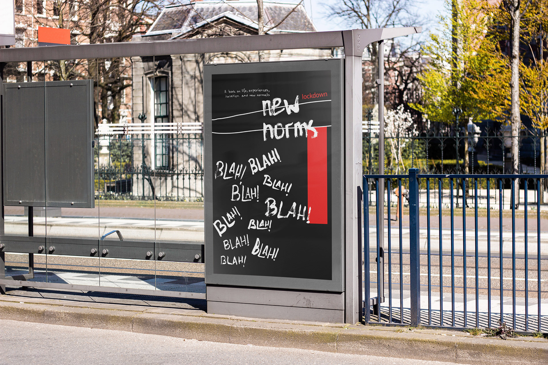
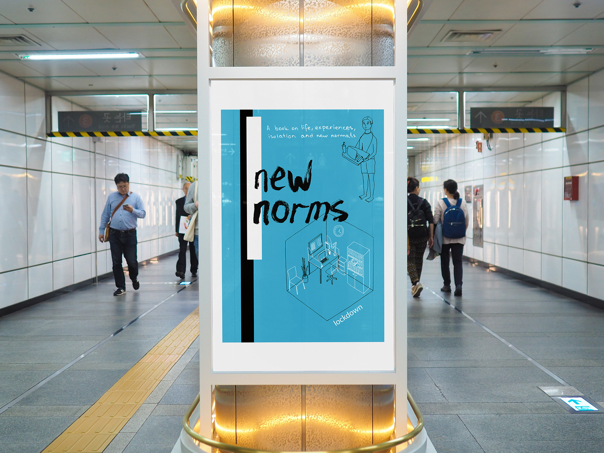
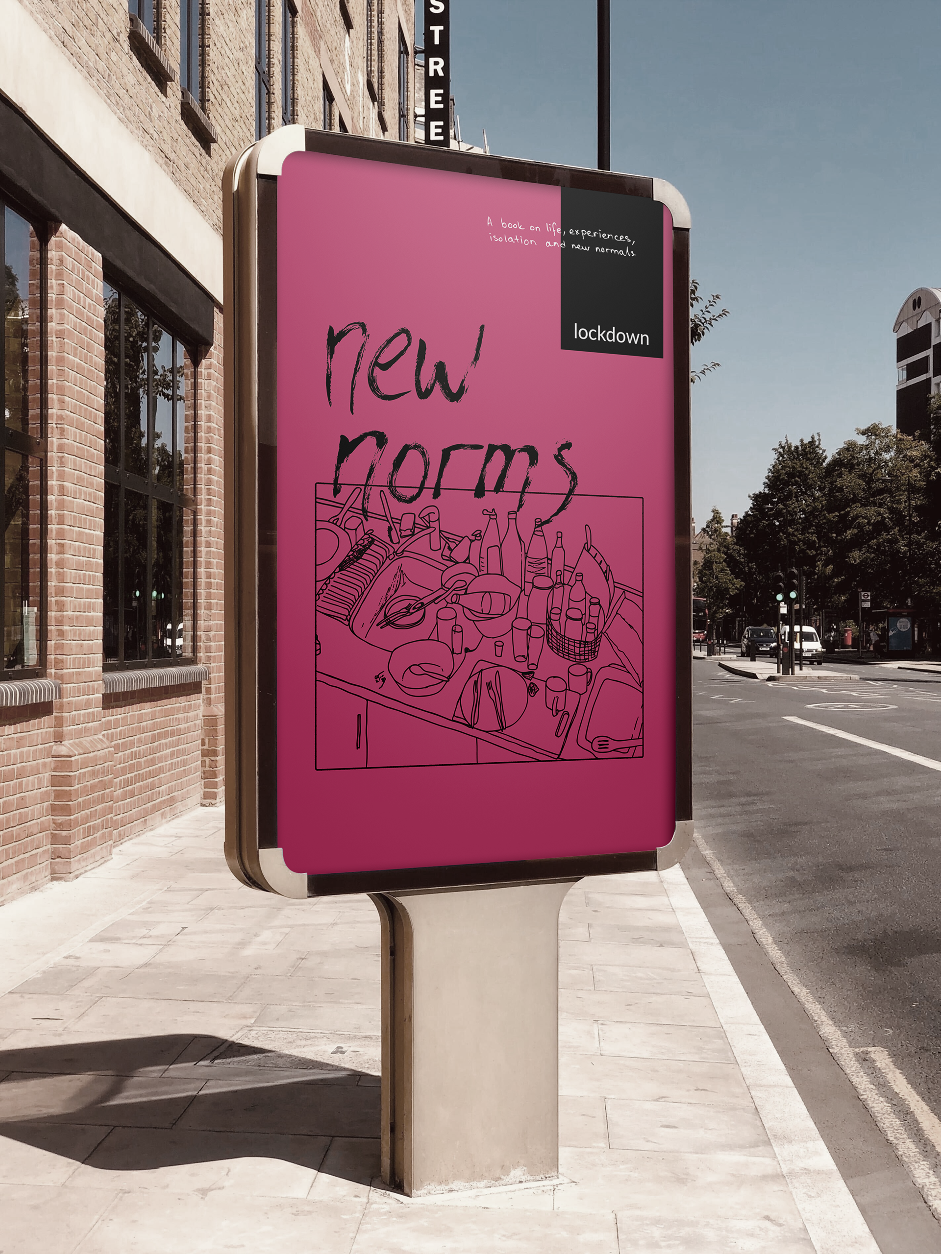
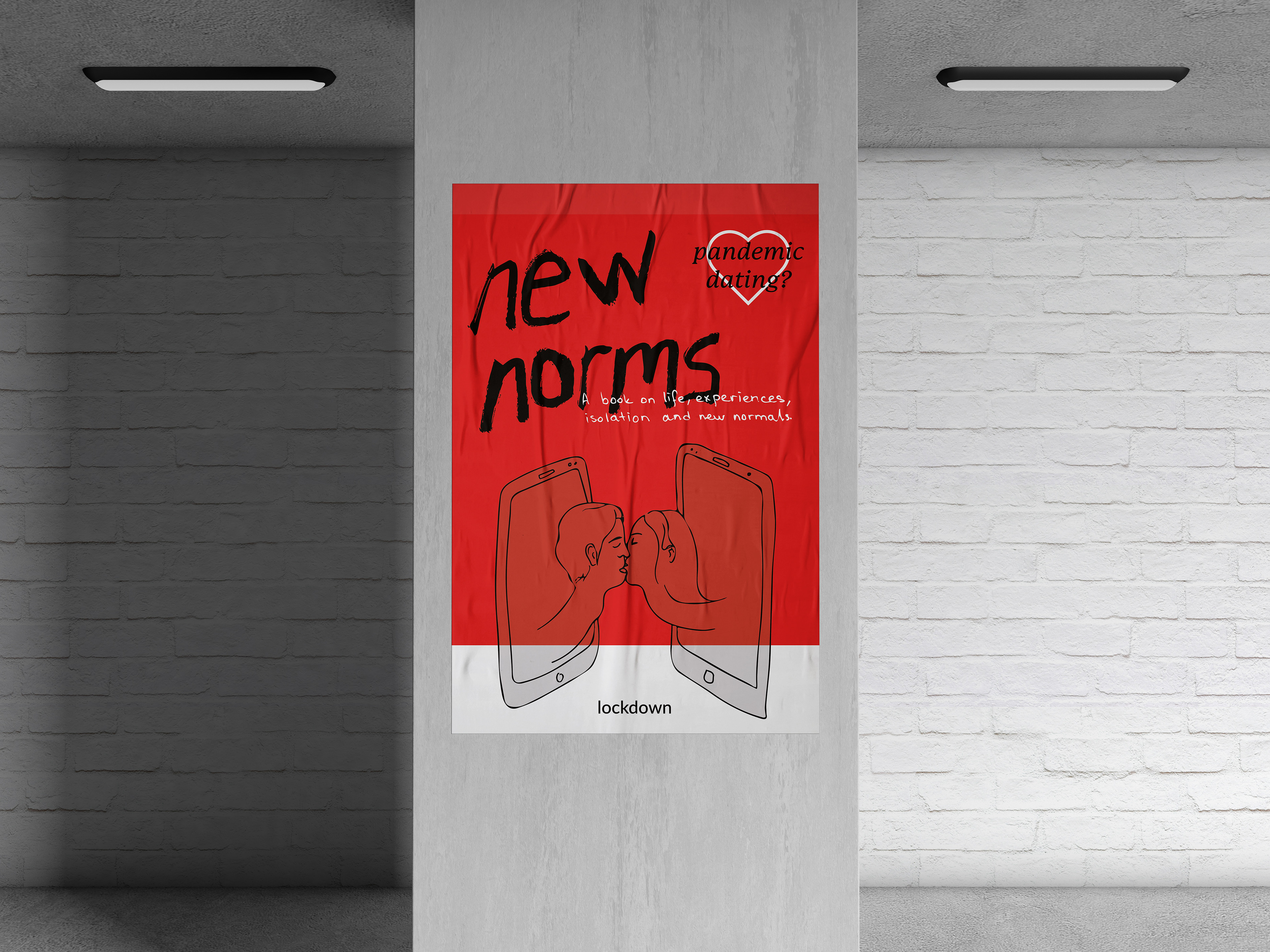
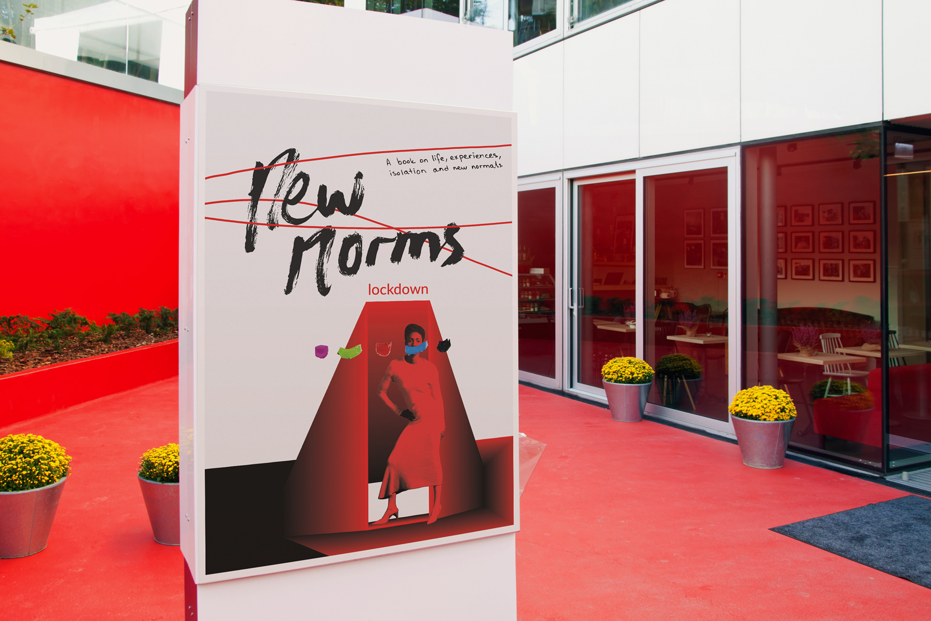
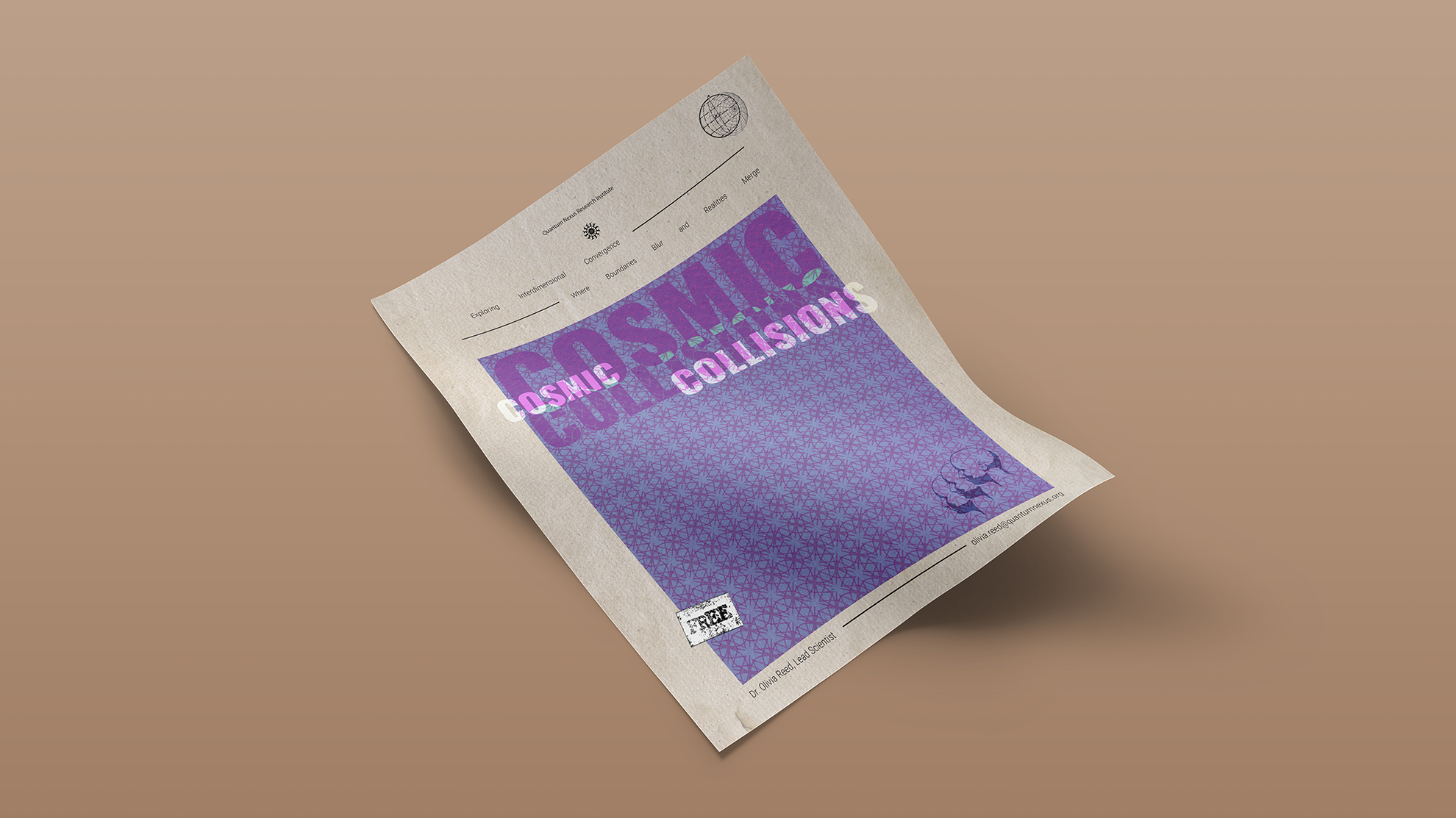
To promote New Norms: Lockdown, I created a series of conceptual poster designs that echo the themes explored within the book—disconnection, absurdity, domestic clutter, emotional highs and lows, and the surreal mundanity of isolation. Each poster adopts a different visual language, using expressive typography, bold colour palettes, and hand-drawn illustrations to capture the diversity of experiences during lockdown. Designed as speculative placements in public spaces, these posters aim to engage passersby with their raw, playful tone—inviting them to reflect on their own version of “normal.”
