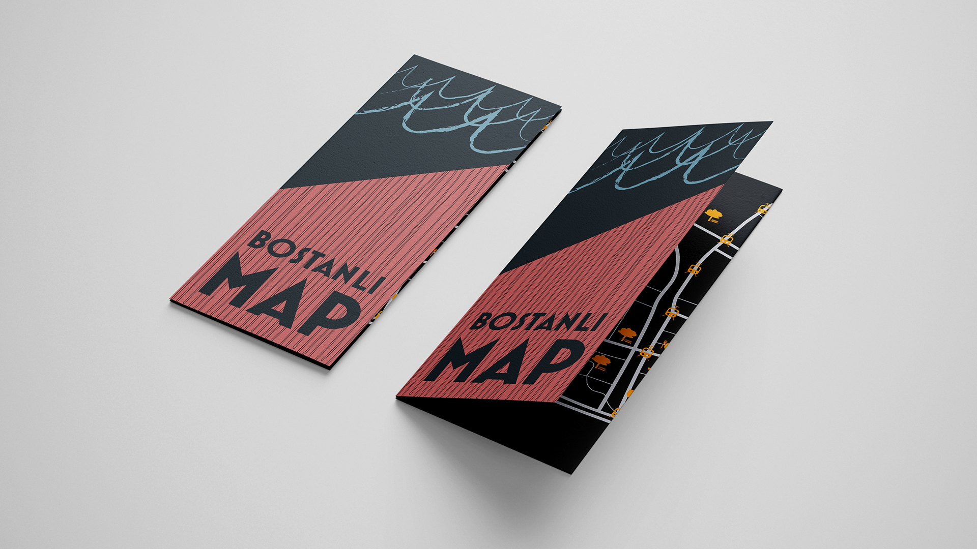
This printed guide was developed for Clerkenwell Design Week 2022 as a functional, fold-out showroom map and brand piece. The aim was to design something instantly eye-catching but also easy to carry, read, and refer to throughout the busy, design-saturated streets of Clerkenwell. The visual language was influenced by the dynamic typography of the CDW brand, enhanced with tactile colour overlays and layered text to emphasise movement, vibrancy, and the celebratory atmosphere of the event. Balancing clarity with creative edge, the map acts as both a navigational tool and a takeaway design artefact.
MAP STRUCTURE & NAVIGATION FLOW
Designing the layout involved carefully structuring the user flow — from opening the map to identifying one's location and cross-referencing brand listings. The challenge was to create a seamless relationship between the directory and the map visuals. Grid structures were refined to maximise readability, with visual cues such as colour-coding and iconography assisting in intuitive navigation.
TYPOGRAPHY & VISUAL LANGUAGE
The typographic direction draws from the CDW identity but introduces an additional layer of expressive overlays to reflect energy and movement. Playful scale contrasts and overlapping textures on the cover echo the density and creative chaos of the festival’s setting, while interior text remains highly legible and information-led.
COLOUR PALETTE & PRINT PRODUCTION
A bold, magenta-forward colour palette was used throughout, in line with CDW’s signature tones, but enriched through the use of layered ink transparencies and tactile finishes. Working closely with print production, special attention was paid to ink coverage, fold accuracy, and paper durability to ensure it would withstand days of heavy use in unpredictable weather.

