Nox Haven is a conceptual event blending immersive sound, visual ritual, and community. As the designer, I developed the visual identity and promotional material for the event’s launch, focusing on evoking the rich sensory world of dark psychedelic music. The outcome is a bold, atmospheric poster and graphic system that invites the viewer into a surreal and enveloping experience—where glitch, mysticism and futurism converge.
The design approach embraces abstraction and intensity, using manipulated textures, layered colour gradients, and synthetic visual noise to reflect the emotional power of the soundscape. From the typographic decisions to the placement of subtle digital grid elements, every detail is intended to build a heightened state of awareness and tension—echoing the ritualistic theme of the night.
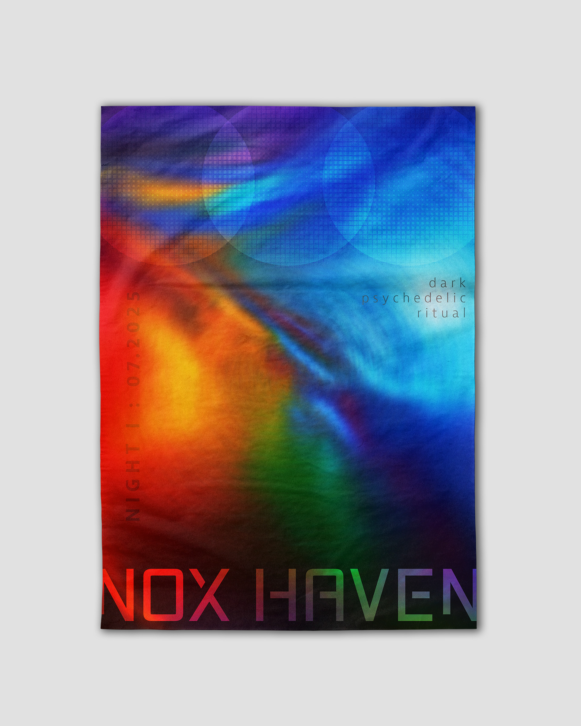
HERO POSTER DESIGN
The poster sets the tone for the Nox Haven experience—mysterious, ritualistic, and immersive. The abstract gradient was created through layered digital distortion and controlled blur, designed to feel elemental and shifting, like smoke or fire caught mid-transformation. Typography is minimal and placed with intention: the event name acts as a monolithic anchor, while the smaller text fades in and out of focus, echoing the slow pull of hypnotic rhythm. This piece acts as the first touchpoint into the world of Nox Haven—a signal that something unseen is about to begin.
LOGO
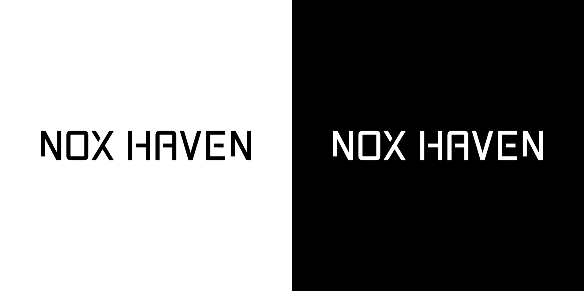
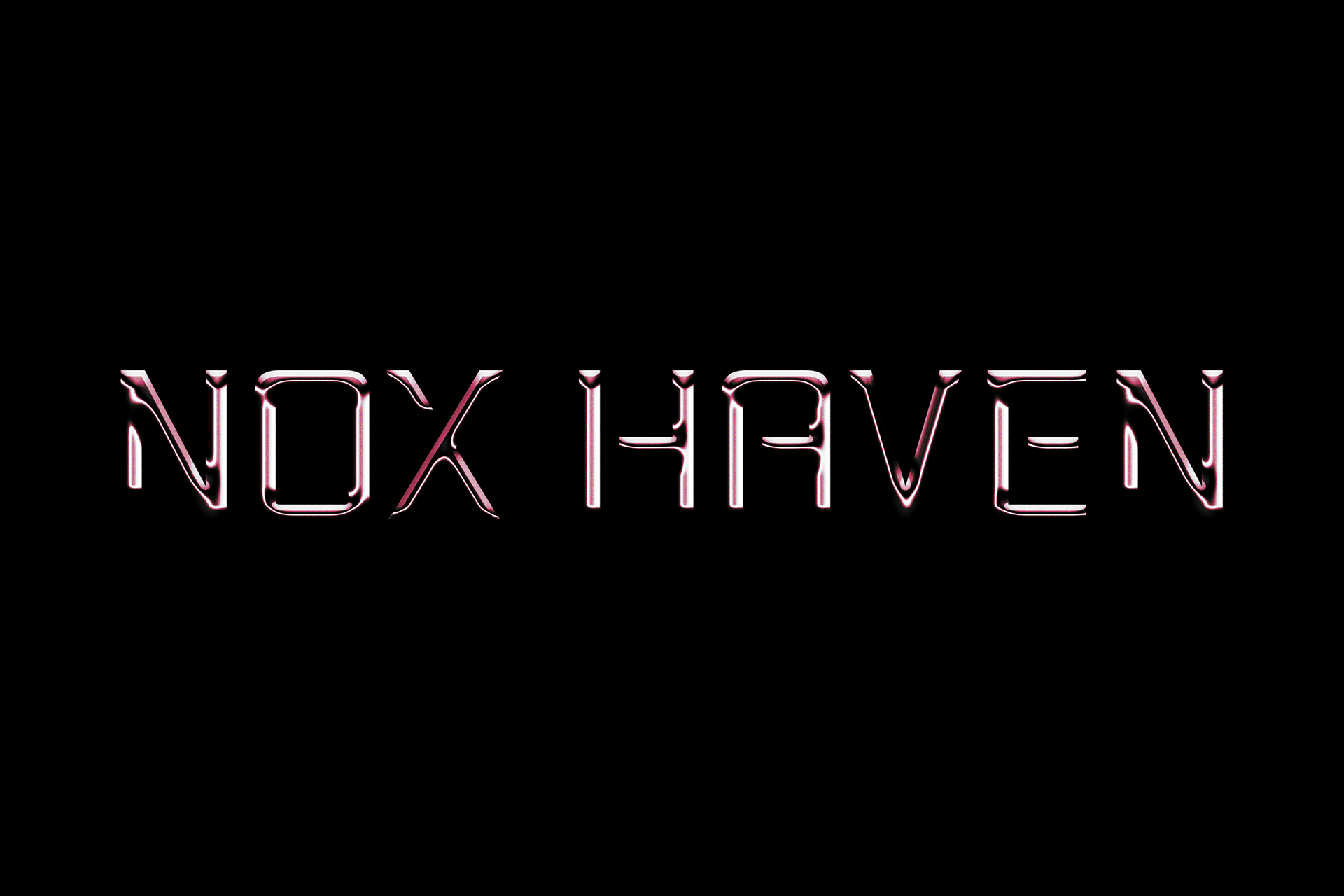
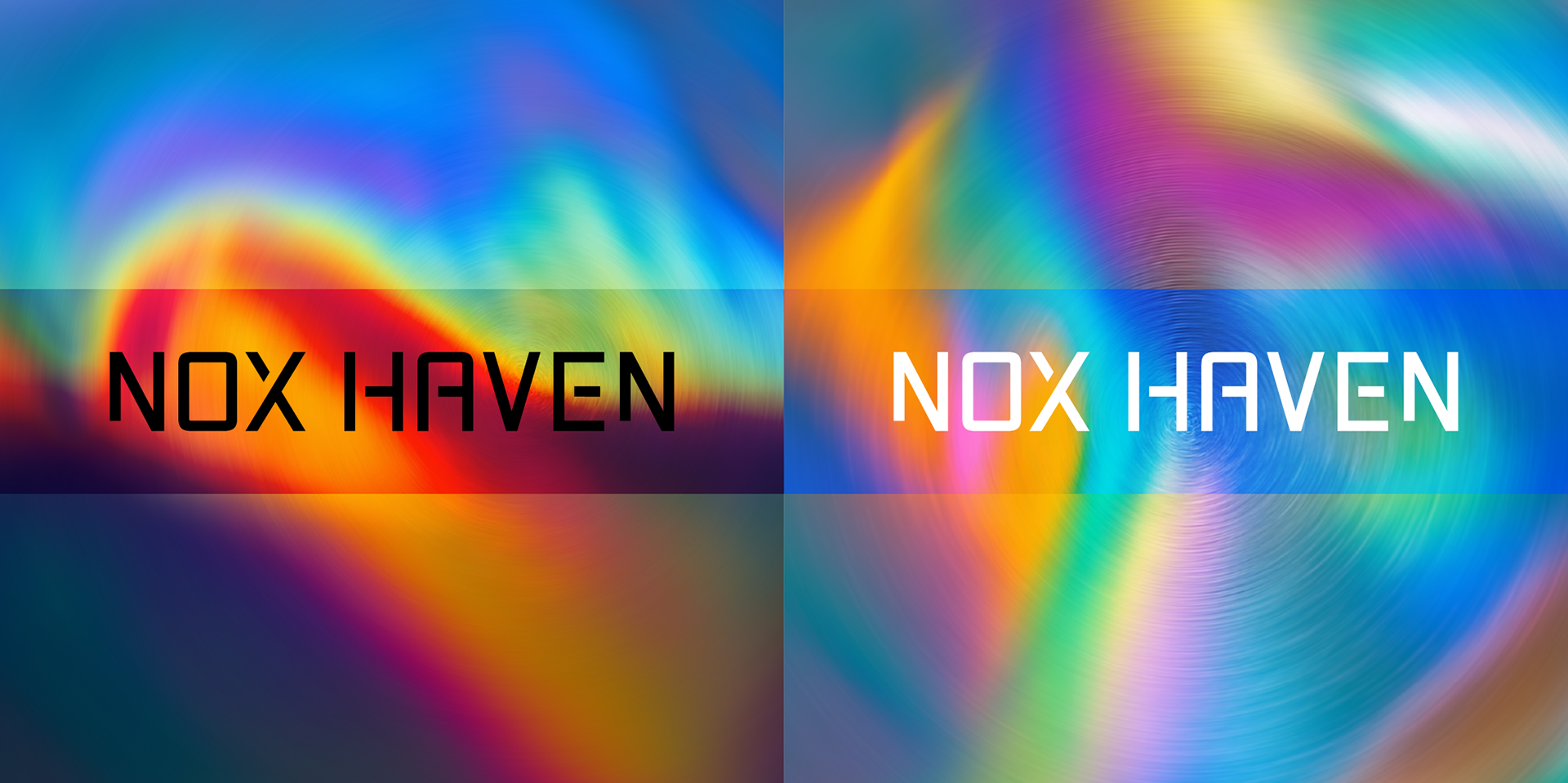
The Nox Haven wordmark was built from a custom modular type system, inspired by brutalist architecture, early 2000s techno flyers, and occult symbolism. It’s geometric, but not sterile—each shape is adjusted to feel slightly off-centre, creating a low-frequency discomfort. This is not a polished festival logo, but one meant to live in shadowy corners, on metallic surfaces, or across glitchy projections. Its simplicity allows it to carry emotional weight, holding space for both structure and unease.
The logo system includes light and dark variants to ensure legibility and tone consistency across different materials. Negative space and spacing have been carefully considered to allow the wordmark to float within busy or textured backdrops, especially in projection mapping or merchandise use. Whether placed over saturated gradients or monochrome textures, the logo remains recognisable and stable—an anchor within the shifting world of Nox Haven.