A FRESH FIRST IMPRESSION
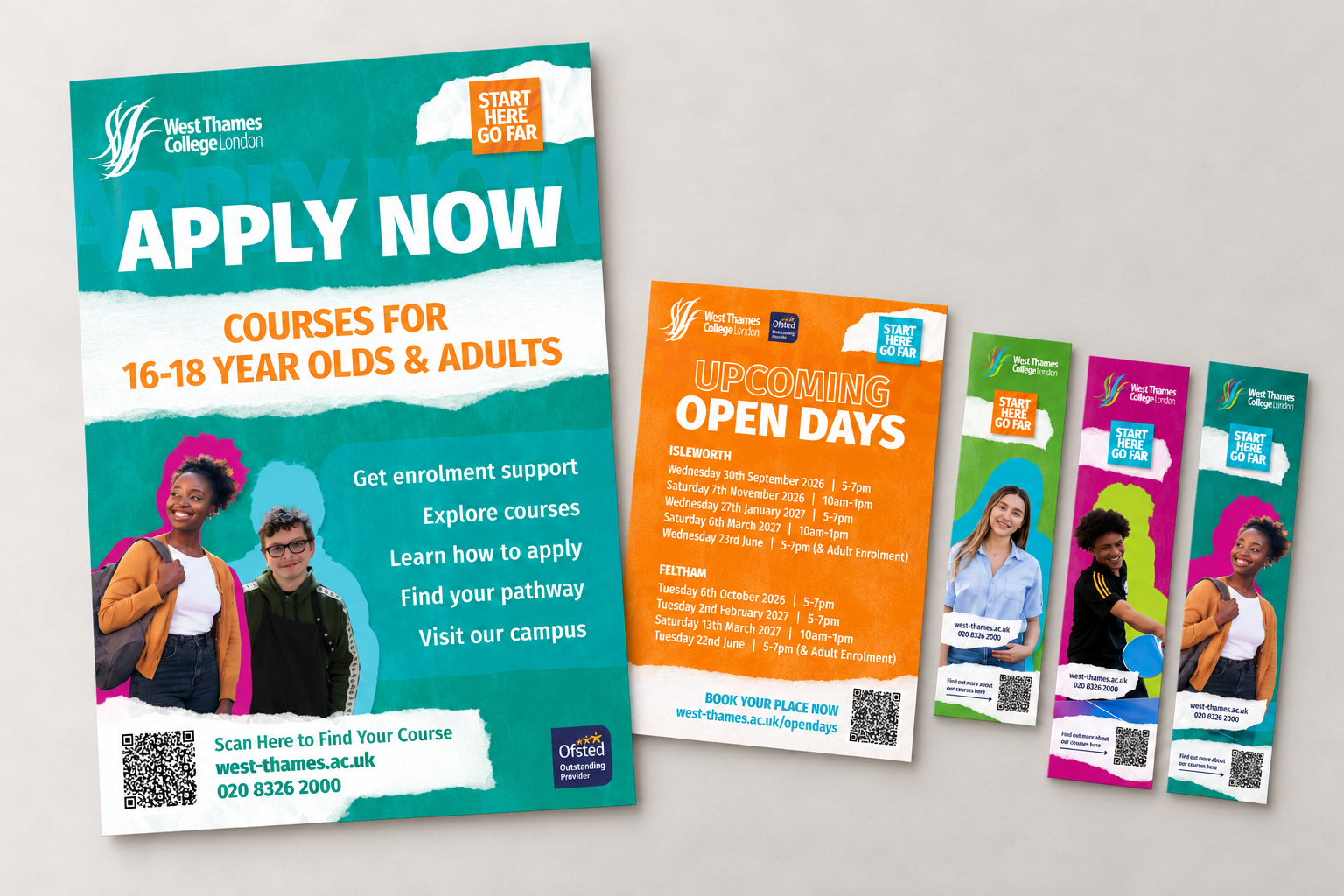
Open Days are an introduction to college life. I developed a new campaign identity for West Thames College to make that first encounter feel energetic, welcoming and full of possibility.
Created from scratch within the college’s existing brand, the direction brings together unexpected colour combinations, student photography, oversized typography and torn-paper textures. It gives Open Day communications a distinctive identity while establishing a foundation for the planned summer 2027 recruitment campaign.
As the college’s sole graphic designer, I led the visual concept, design development and adaptation across print, digital and campus displays.
As the college’s sole graphic designer, I led the visual concept, design development and adaptation across print, digital and campus displays.
ROLE
Creative direction · Campaign identity · Print and digital design
Creative direction · Campaign identity · Print and digital design
DELIVERABLES
Event graphics · Social media assets · Website banner · Flyers · Posters · Roller banner · Railing banner · Bookmarks
Event graphics · Social media assets · Website banner · Flyers · Posters · Roller banner · Railing banner · Bookmarks
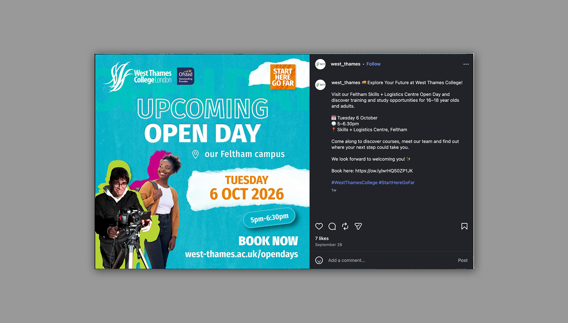
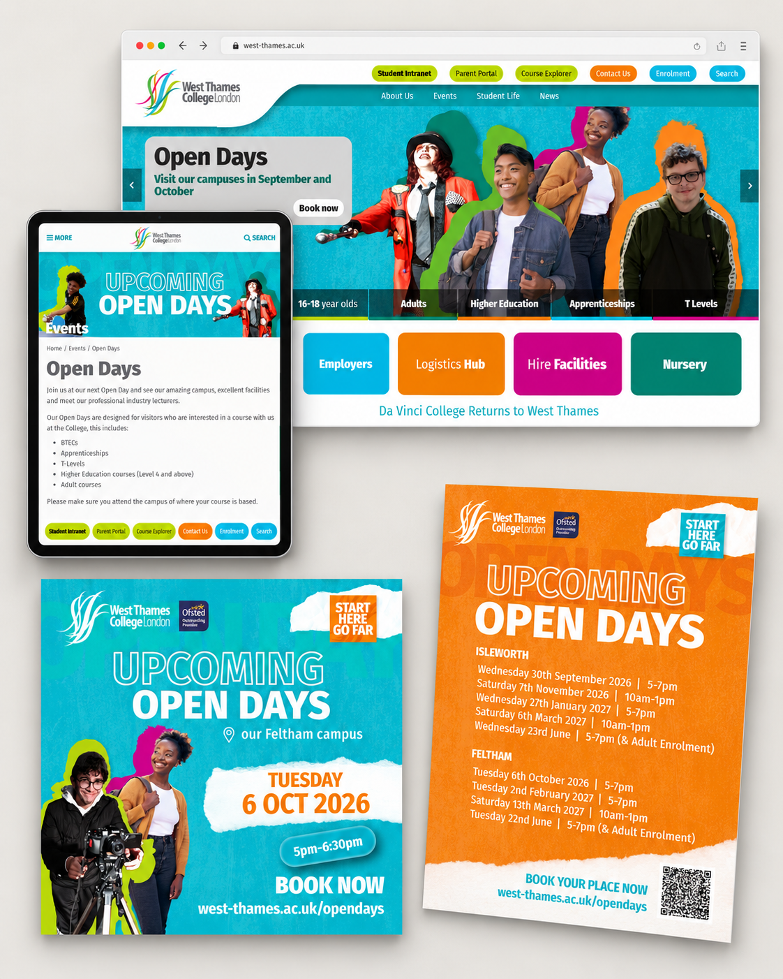
ONE CAMPAIGN, DIFFERENT FORMATS
The identity adapts from a compact social post to a wide website banner and an information-led printed flyer. Layouts change to suit each format, while recurring colours, typography and paper textures keep the campaign recognisable.
Clear headlines and contrasting information panels give event dates, locations and booking details a consistent place within the design.
COLOUR WITH PERSONALITY
The college palette becomes a collection of contrasting combinations. Each bookmark pairs a student photograph with a bold background and an offset silhouette, creating an individual design within a consistent series.
Across the collection, colour brings variety while the shared composition holds everything together.

FROM FIRST CLICK TO CAMPUS
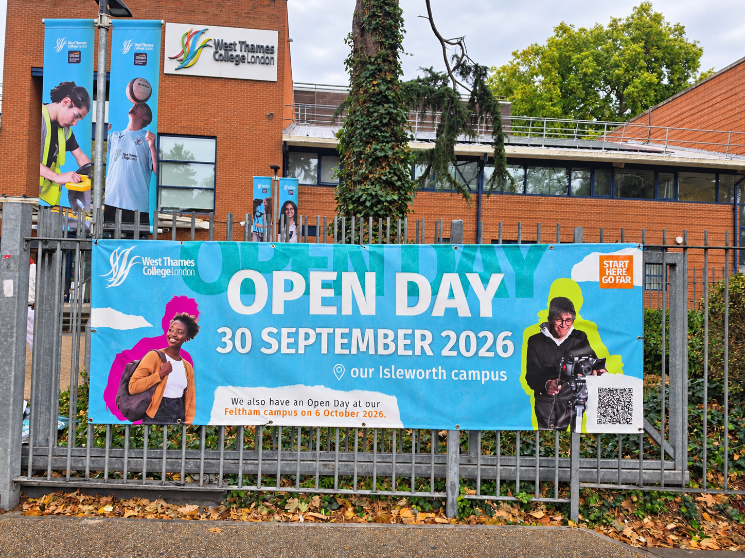
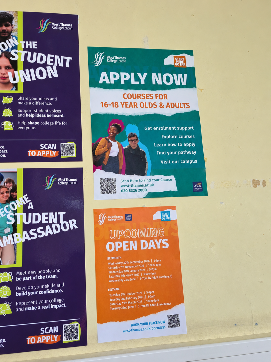
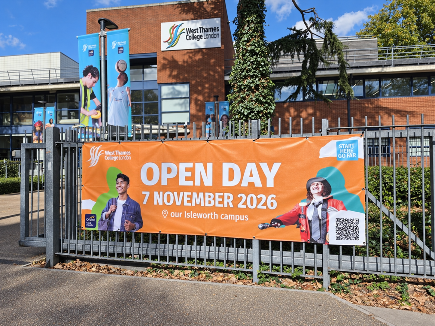
The campaign continues into the physical college environment through outdoor banners, welcome signage and recruitment posters. Repeated visual elements connect the invitation to attend with the experience of arriving on campus.

BUILDING THE VISUAL LANGUAGE
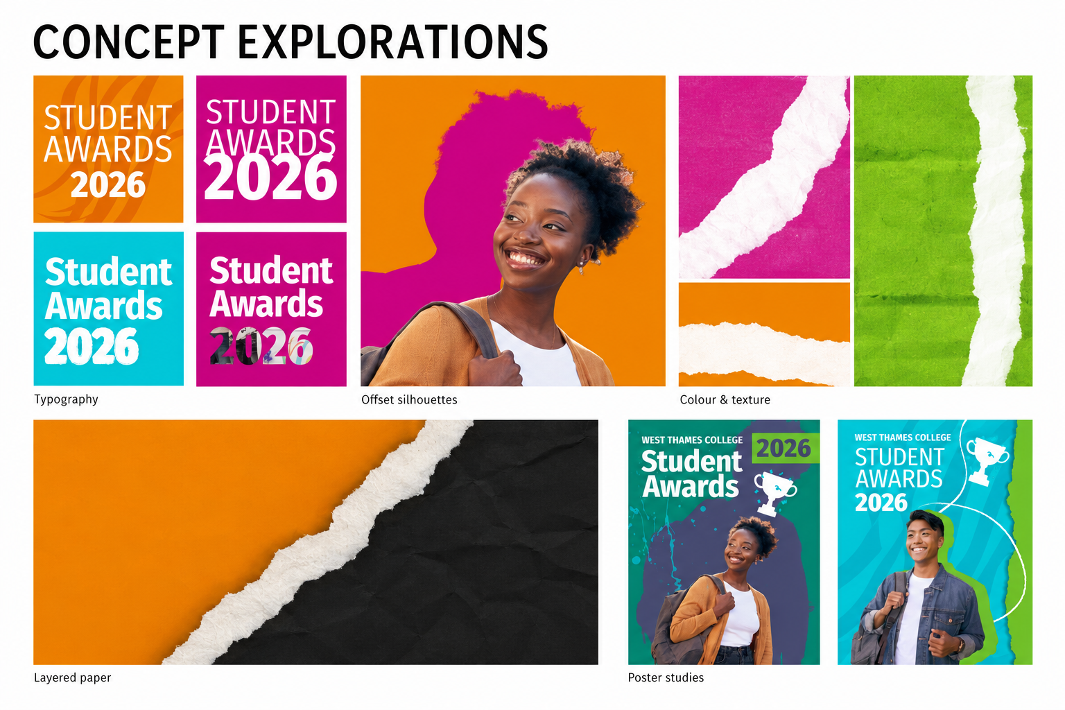
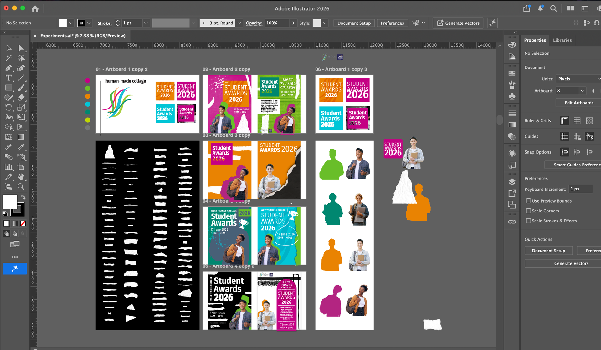
Exploration began after the Student Awards project had finished, using its event wording to test new visual ideas. This is why the early studies shown here still carry the Student Awards title.
The direction developed partly as a response to that event’s more serious tone. For Open Days and recruitment, I wanted something brighter, more energetic and refreshing: a new expression of the college’s colours that would feel welcoming to prospective students.
Offset silhouettes, torn-paper textures and oversized typography became the foundations of the identity. These elements could shift between colour combinations and formats, with the silhouettes also working independently of photography on the welcome banner.
DESIGNED TO GROW
Launched through the 2026–27 Open Days, this identity is the starting point for a broader recruitment campaign. The next phase will develop the visual direction for summer 2027, building continuity across the college’s communications.
The project is ongoing, with further applications to follow.