The Higher Education Fair 2026 brought together universities and education providers from across the UK, giving students direct access to guidance on degree options, progression routes, and future career pathways.
As the Graphic Designer at West Thames College, I led the full visual identity and campaign rollout for the event. From initial concept development through to final artwork, I created a cohesive design system spanning promotional materials, printed programmes, participating institution directories, event signage, roller banners, and environmental graphics.
The project required clear communication, strong visual impact, and consistency across multiple formats, ensuring the event felt accessible, engaging, and aligned with the college’s wider brand identity.
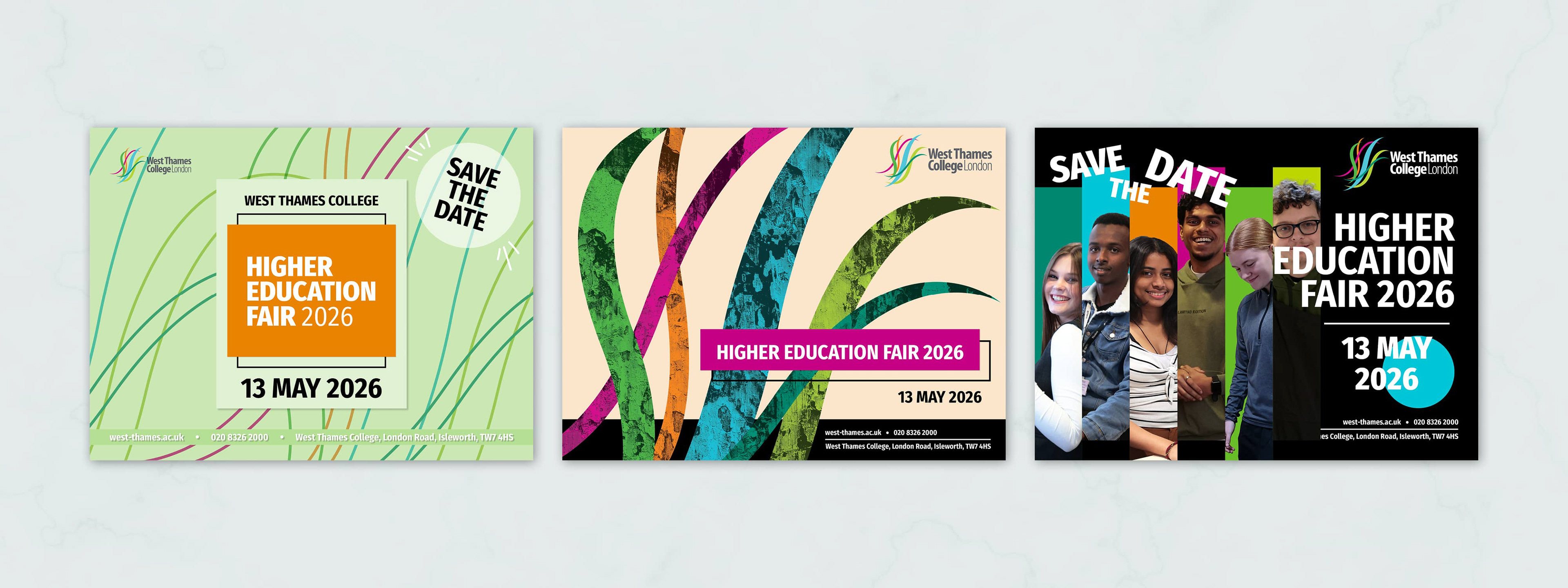
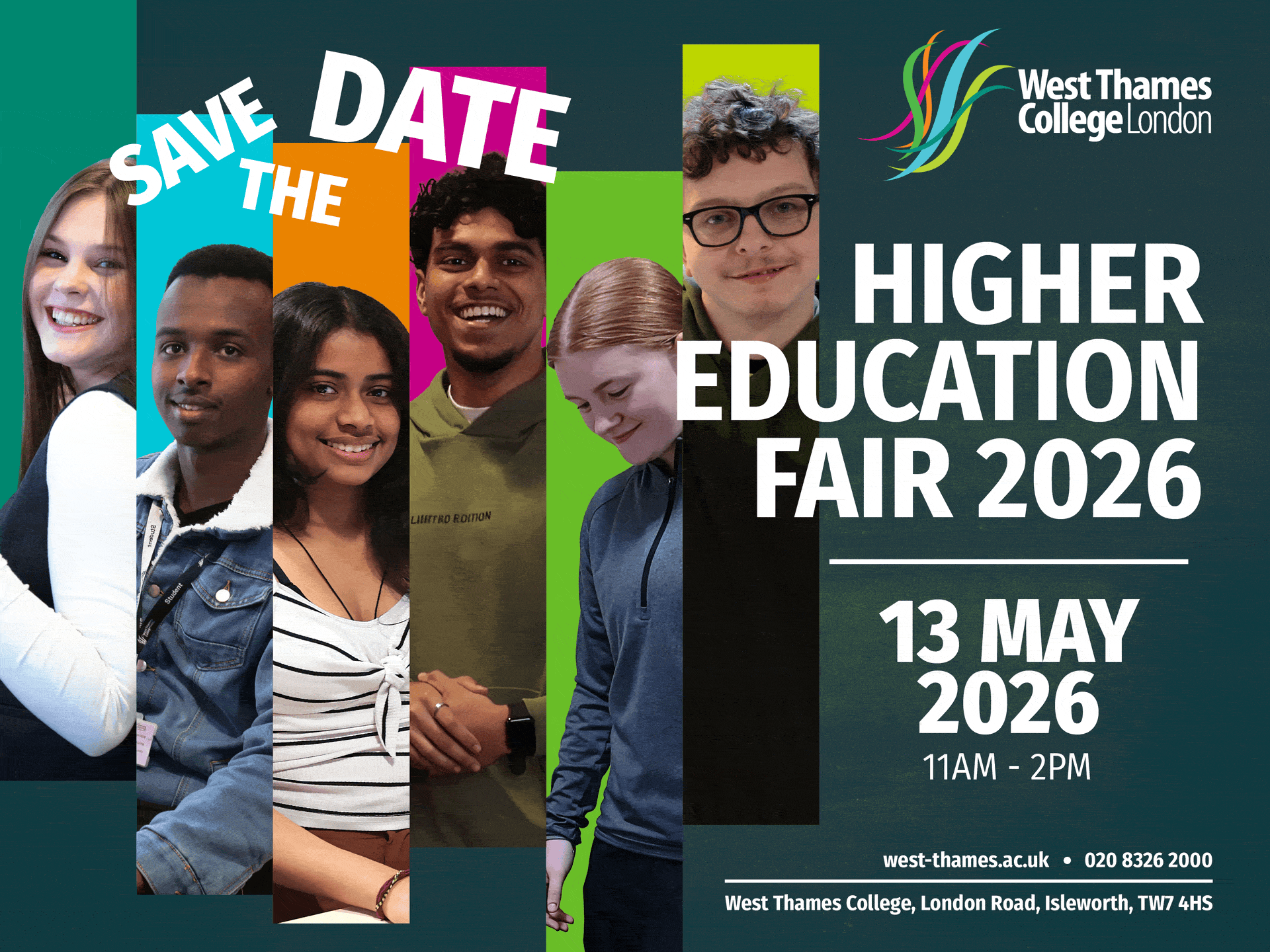
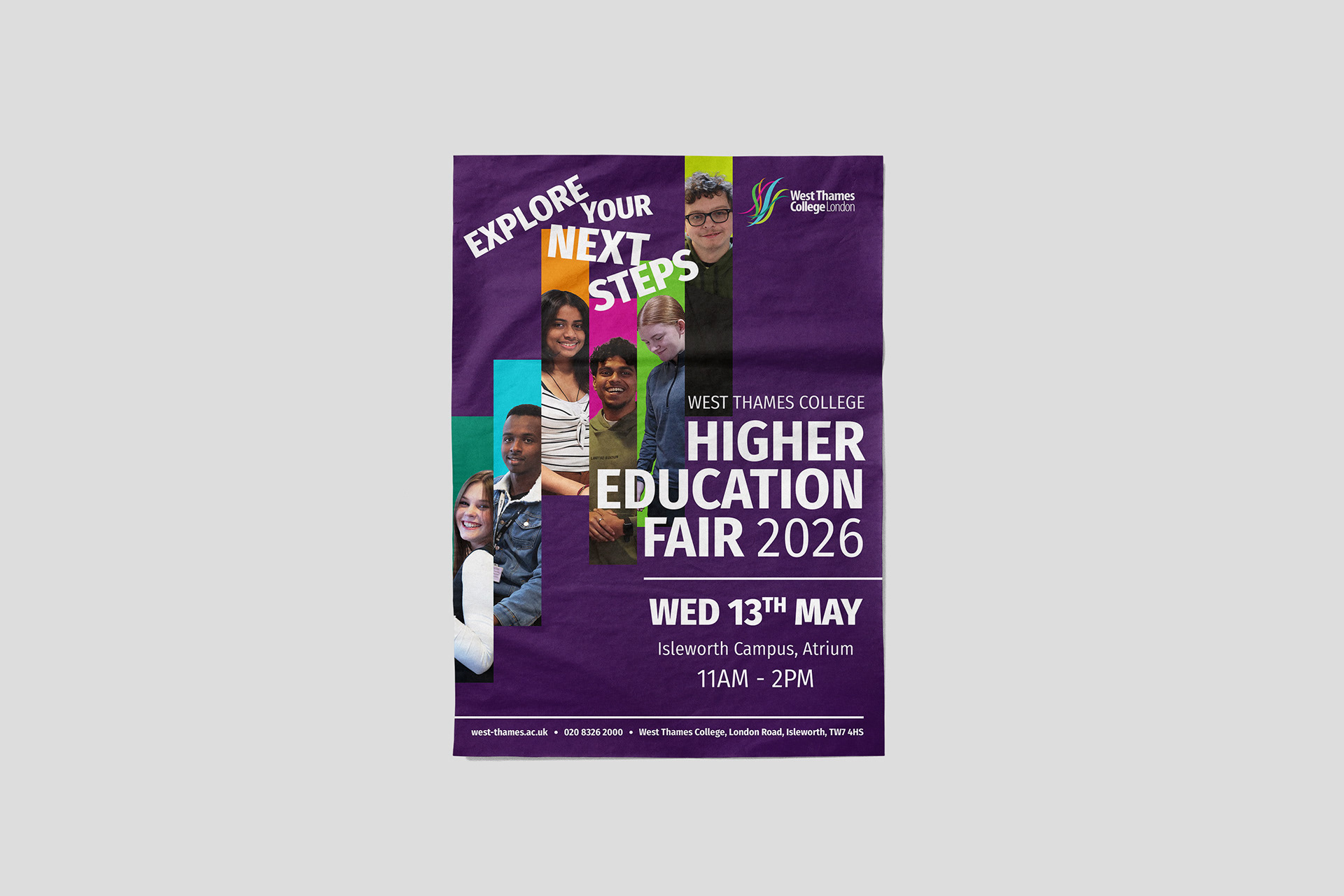
A STUDENT-FOCUSED EVENT IDENTITY
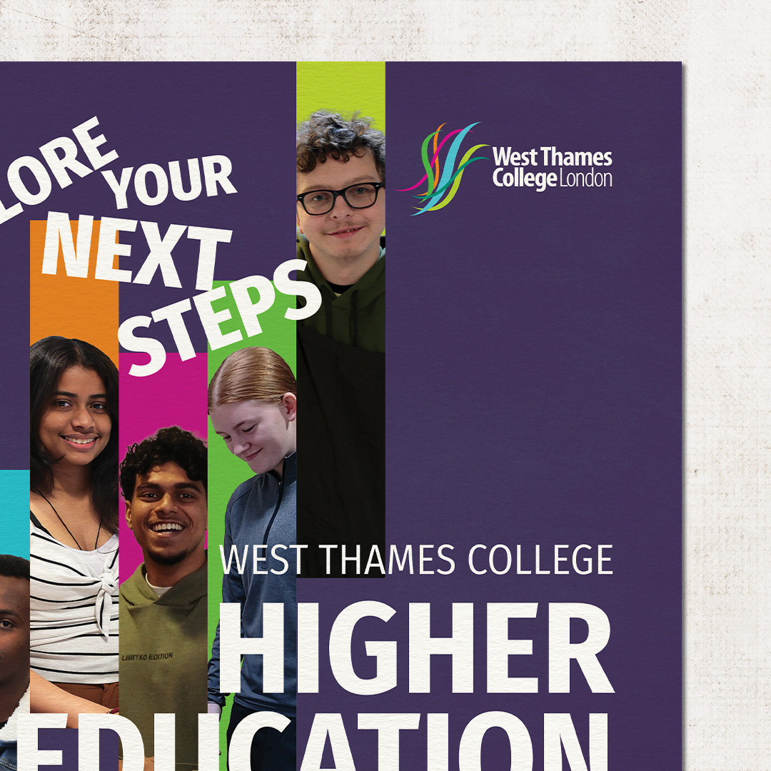
The campaign identity was designed to feel clear, energetic, and accessible for students exploring their next steps.
The final direction combined real student photography, bold typography, and vibrant colour blocks drawn from the West Thames College brand. This created a strong visual system that could work across posters, programmes, signage, and large-format event graphics while remaining recognisable across campus.
PRINTED MATERIALS
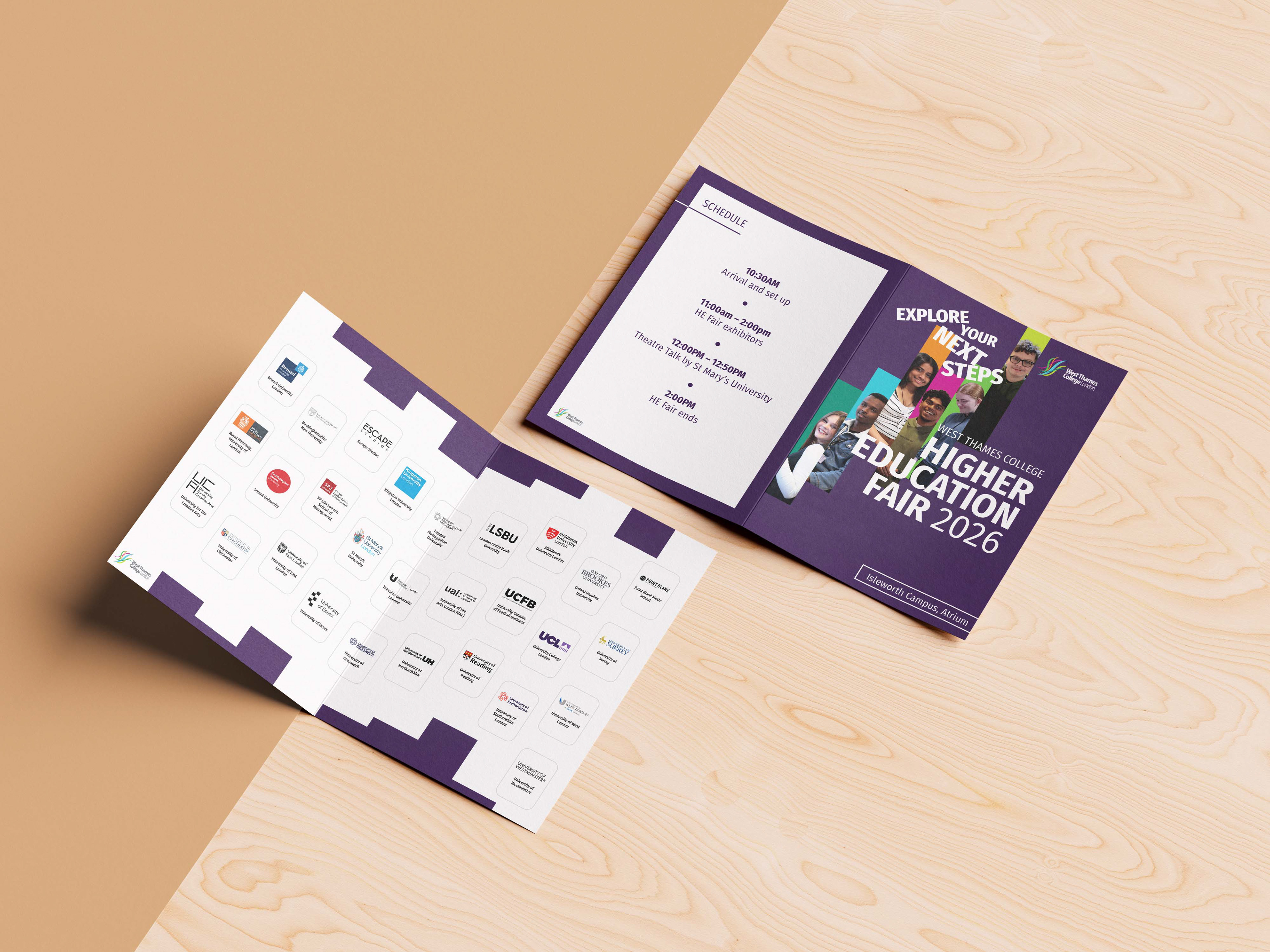
PROGRAMME & PARTICIPATING INSTITUTIONS GUIDE
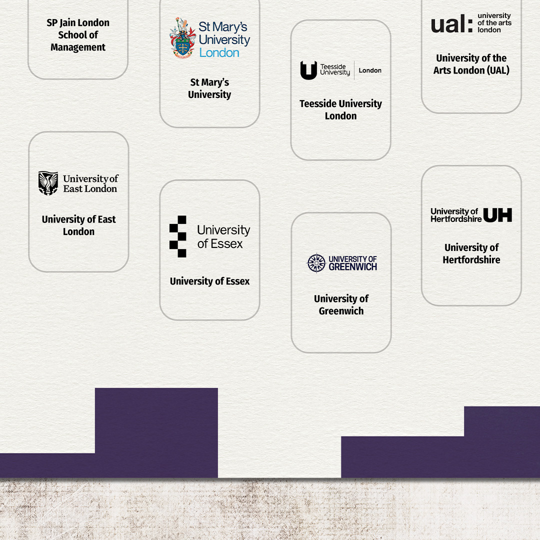
As part of the wider campaign, I designed a printed programme featuring event schedules, attendee information, and a directory of participating universities and institutions.
The design balanced information density with clarity, creating an intuitive reference guide that allowed students to quickly discover exhibitors and navigate the event. Consistent typography, colour, and layout principles ensured the programme remained fully aligned with the overall visual identity.
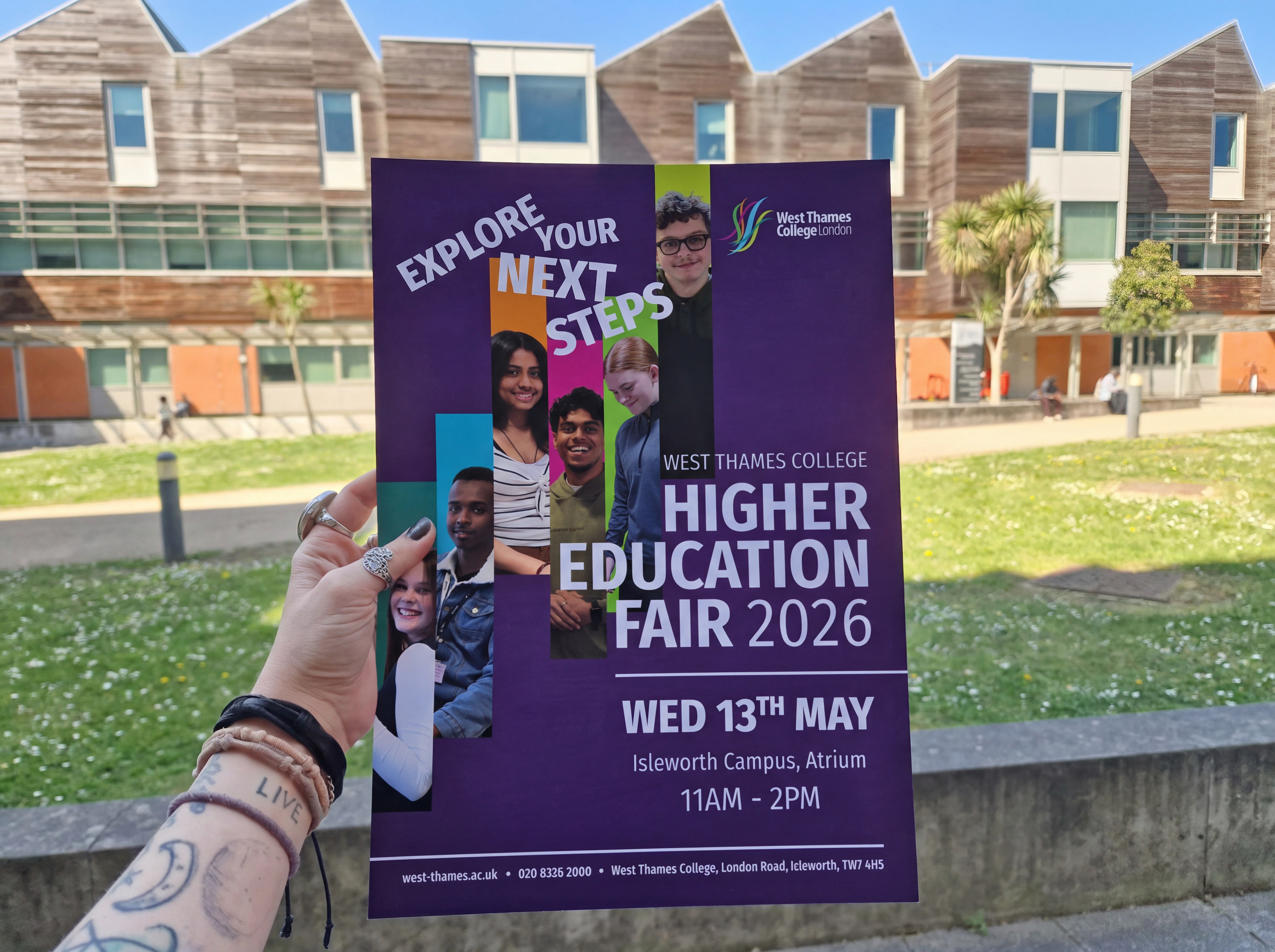
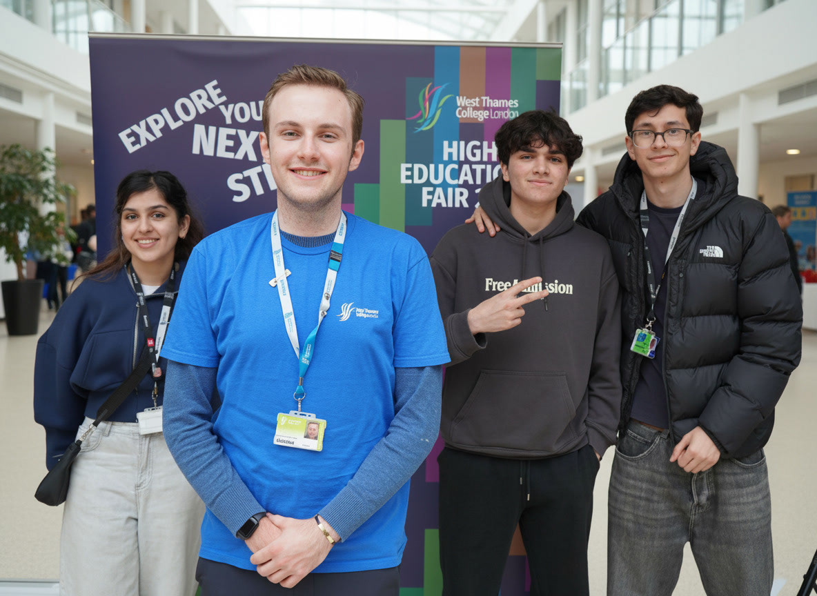
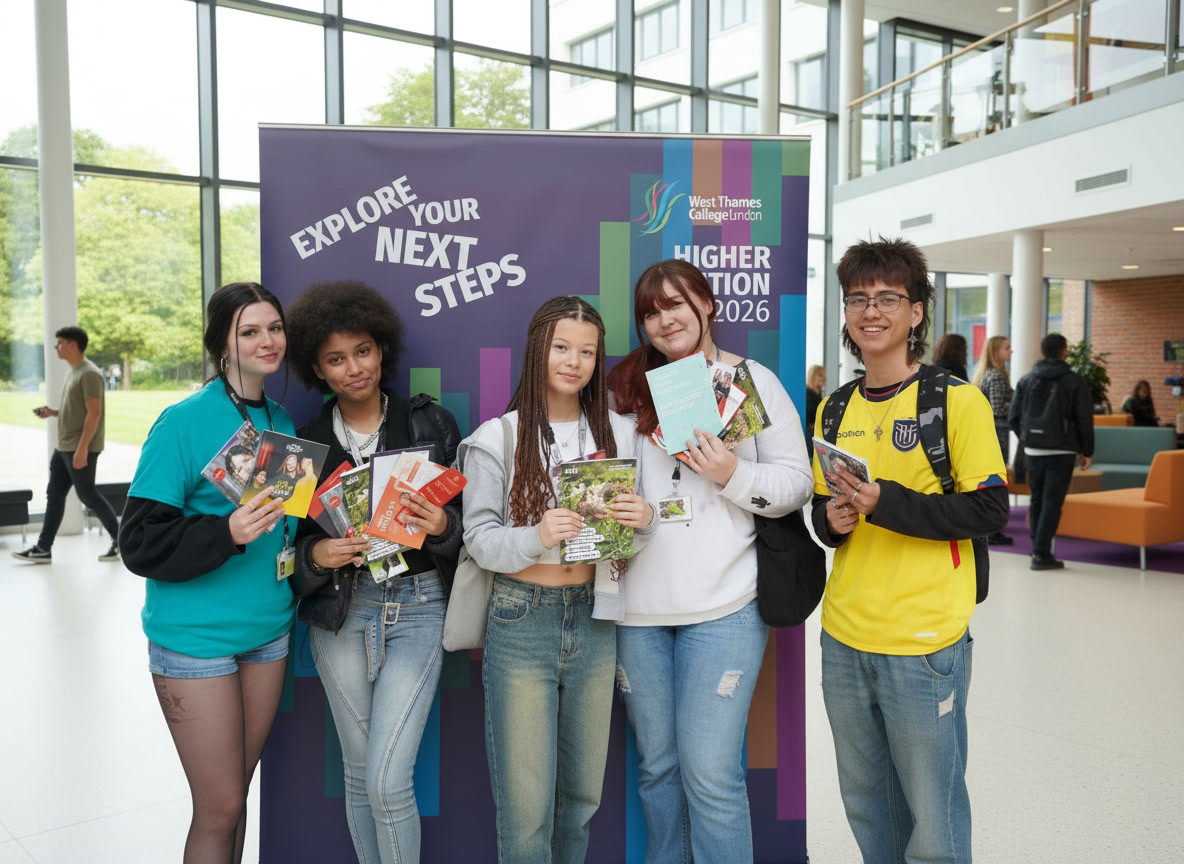
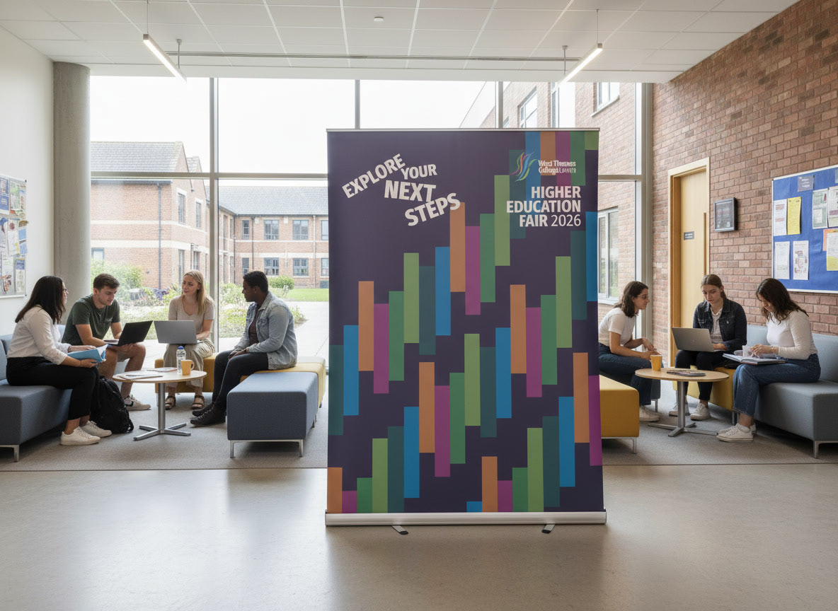
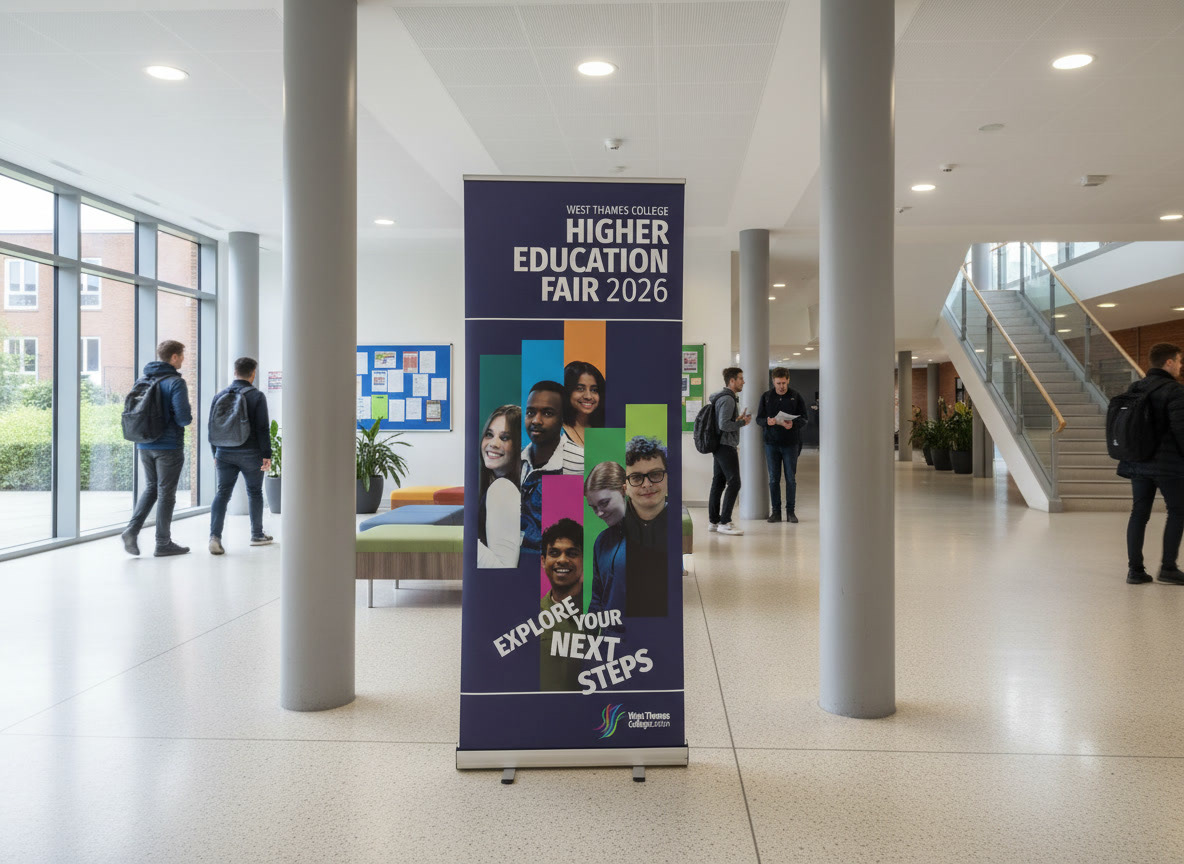
The visual identity was extended into a series of large-format applications used throughout the campus environment.
Roller banners and event signage helped create a recognisable visual presence while guiding visitors through the event space and reinforcing the campaign identity at key touchpoints.
DESIGN DEVELOPMENT
The final identity emerged from several initial creative directions exploring different approaches to colour, imagery, typography, and visual hierarchy.
The selected concept underwent multiple rounds of refinement, with adjustments made to improve readability, strengthen visual impact, and ensure consistency across every campaign touchpoint.
The progression below shows the evolution from early concepts through to the final approved design system.