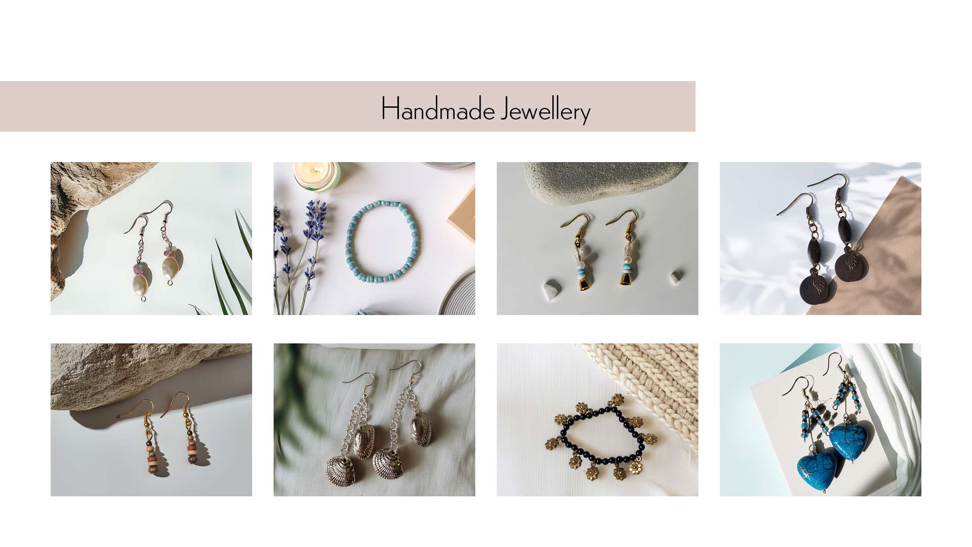
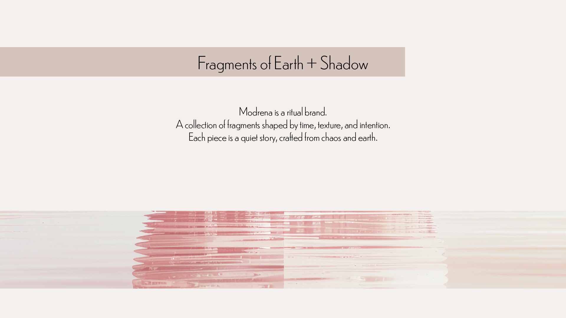
Modrena is a tactile, small-batch jewellery brand rooted in the idea of wearable talismans. The brand identity draws from ritual, earth memory, and surreal design objects, crafted to feel like fragments unearthed from a forgotten civilisation. The goal was to build a brand that feels timeless, handmade, and quietly esoteric while remaining minimal and modular for digital use.
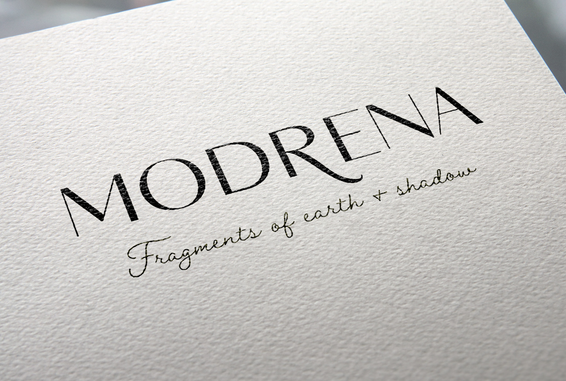
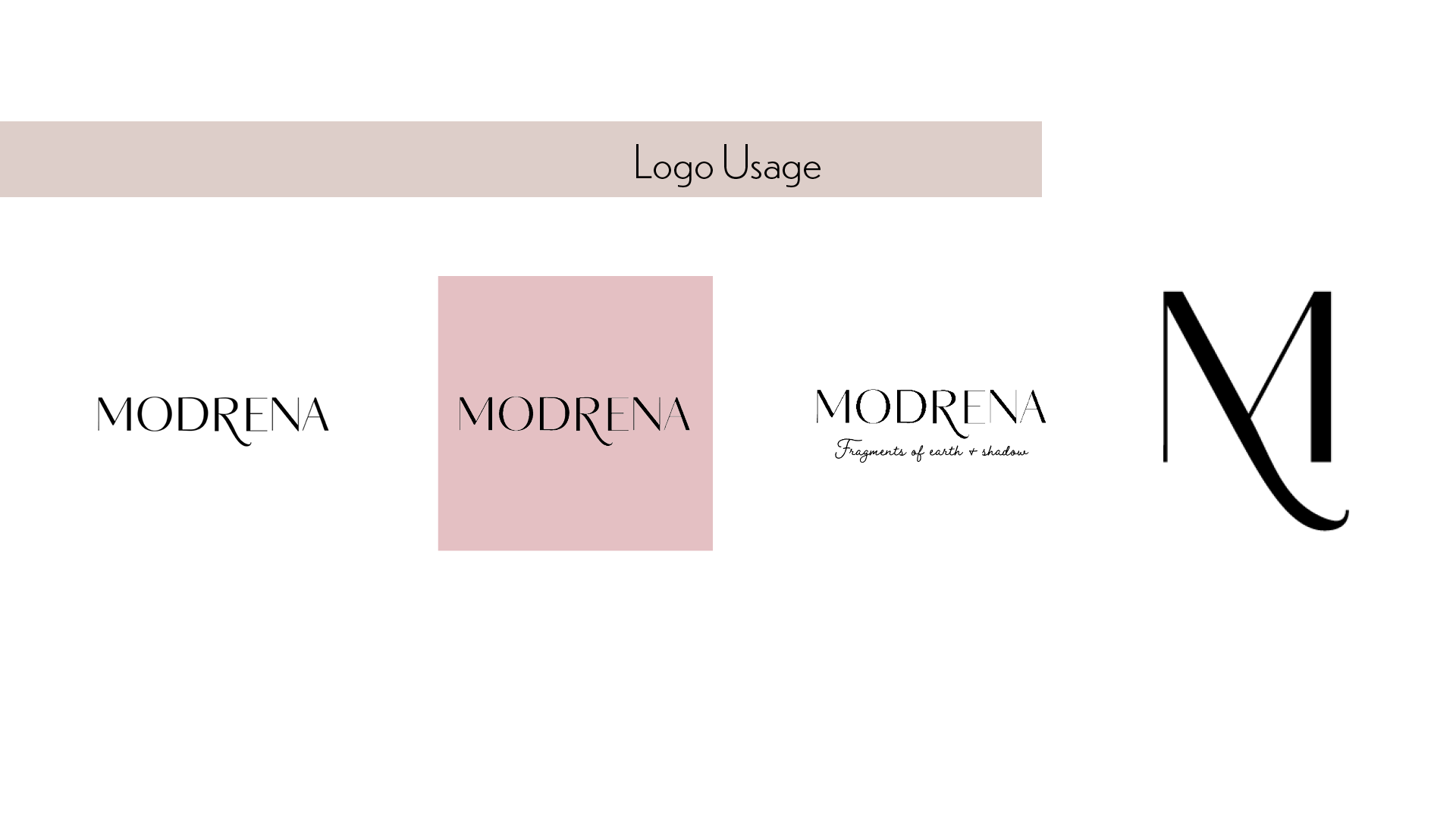
The core symbol represents a glyph-like monolith, designed to feel ancient and intentional. It combines rawness with symmetry, balancing the energy of worn relics and contemporary icon systems. The mark is scalable, recognisable at small sizes, and lends itself to use on physical objects like tags, stamps, and wax seals. Its simplicity masks a sense of myth.
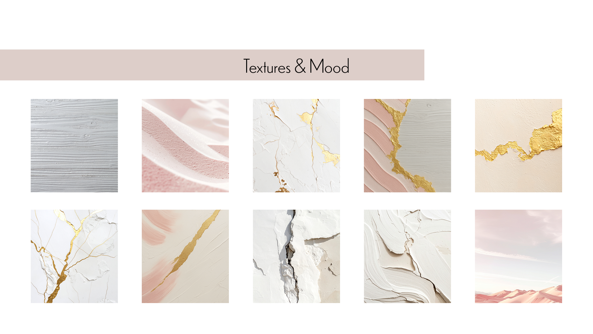
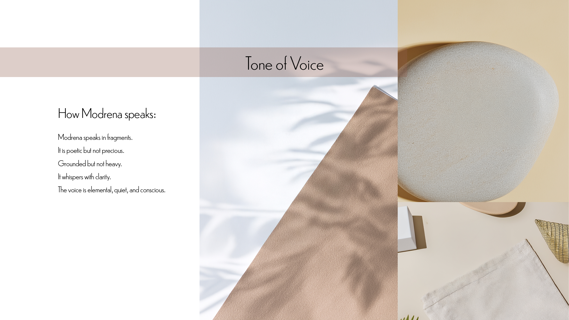
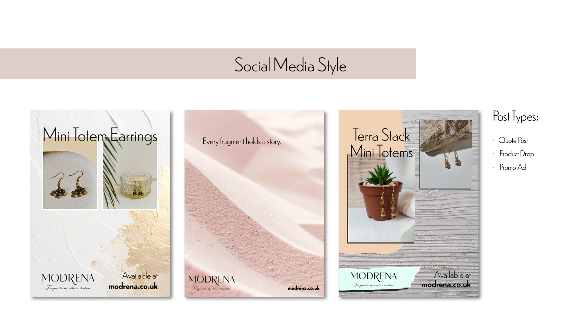
Social design for Modrena is deliberately slow and composed. Text overlays are used sparingly and with precision, often letting a single phrase or tagline carry the emotional weight. Image treatments lean into shadow and material texture, pairing jewellery with natural surfaces like stone, bark, or linen to build visual lore.
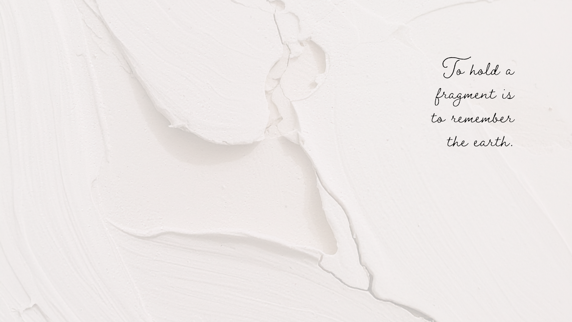
These visuals follow a format that helps convey trust, while the design language hints at something a little uncanny. The aim is to build mystery and recognisability; to feel like you’ve stumbled upon an artefact, not an ad.
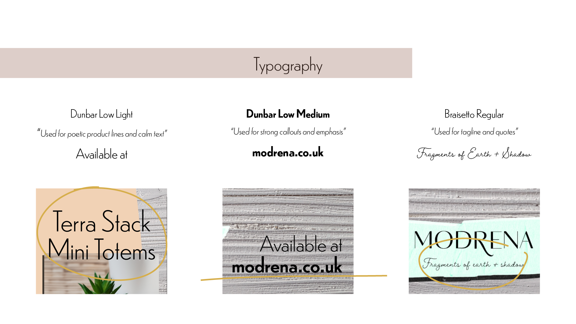
Typography plays a dual role in the Modrena brand system.
Dunbar Low Light is used for titles and product names, chosen for its calm geometry and subtle humanist flair.
Dunbar Low Medium anchors the more authoritative brand touchpoints, such as web footers and packaging stamps.
For the tagline and quotes, Braisetto introduces contrast: a quiet, romantic serif that adds softness without veering into nostalgia.
Together, these typefaces evoke clarity with character: a voice that feels both precise and personal.
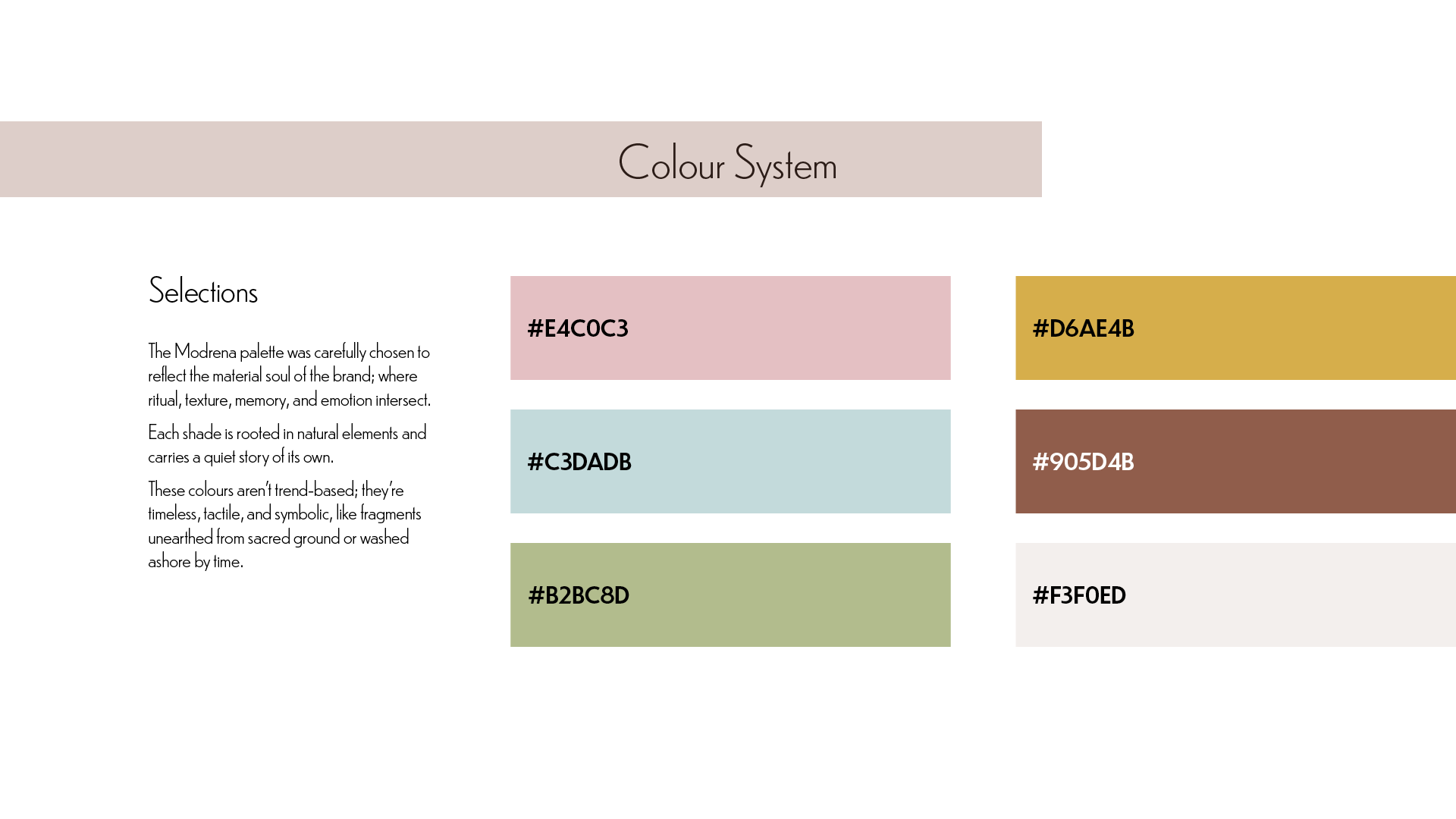
The colours of Modrena are drawn from earth, clay, and shadow.
Deep charcoal grounds the brand in mystery, while muted tones like moss green, chalk white, and clay brown appear across different components to reflect the hand-touched materials of the jewellery. The palette avoids digital glossiness; instead, it leans into a slightly faded, timeworn aesthetic that suggests texture and history.
These tones support the idea of Modrena as a slow object brand; one that exists outside seasonal trend cycles.