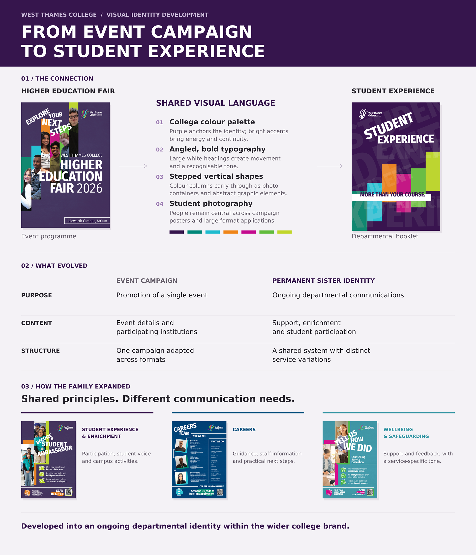

Originally developed for a single event, this visual language became the foundation for a permanent Student Experience identity at West Thames College.
Following the positive response to my Higher Education Fair campaign, the Student Experience department asked me to extend its visual approach across their wider communications. I developed a sister identity within the college brand, with distinct variations for Careers, Wellbeing and Safeguarding, and Student Experience and Enrichment.
As the college’s sole Graphic Designer, I led the design development and rollout across printed publications, recruitment campaigns, digital displays and large-format graphics. The challenge was to give a diverse range of services a shared identity, with enough flexibility for each to communicate with its own character.
CLIENT
West Thames College
West Thames College
ROLE
Graphic Design & Art Direction:
identity development, design and artwork production
Graphic Design & Art Direction:
identity development, design and artwork production
DELIVERABLES
Departmental identity, service variations, student booklet, campaign posters, digital display graphics, roller banner and staff profiles
Departmental identity, service variations, student booklet, campaign posters, digital display graphics, roller banner and staff profiles
YEAR
2026
2026

ONE IDENTITY, MULTIPLE SERVICES
Bold typography, geometric colour blocks and layered photography establish a shared visual language across the department. Variations in palette, imagery and composition give each service its own character while maintaining a clear family resemblance.
The system adapts to different communication needs: energetic recruitment messages for student participation, detailed guidance for Careers, and a more measured tone for wellbeing and support.

BRINGING STUDENT EXPERIENCE TOGETHER
The Student Experience booklet brings support services, enrichment activities and opportunities for participation into one publication.
I developed a colour-coded structure to distinguish the different areas, combining clear information hierarchy with photography and expressive graphic elements. Each section has its own visual character while remaining connected to the wider identity, making the booklet both a practical reference and an introduction to life beyond the classroom.


PUTTING STUDENT VOICE IN THE PICTURE
The Student Ambassador and Student Union campaigns use prominent student photography, bold headlines and direct calls to action to invite participation.
I adapted each campaign across portrait posters and landscape digital displays, reworking the composition and hierarchy for each format. The result is a consistent campaign presence across campus, with the message remaining clear at different sizes and viewing distances.


A VISIBLE PRESENCE ACROSS CAMPUS
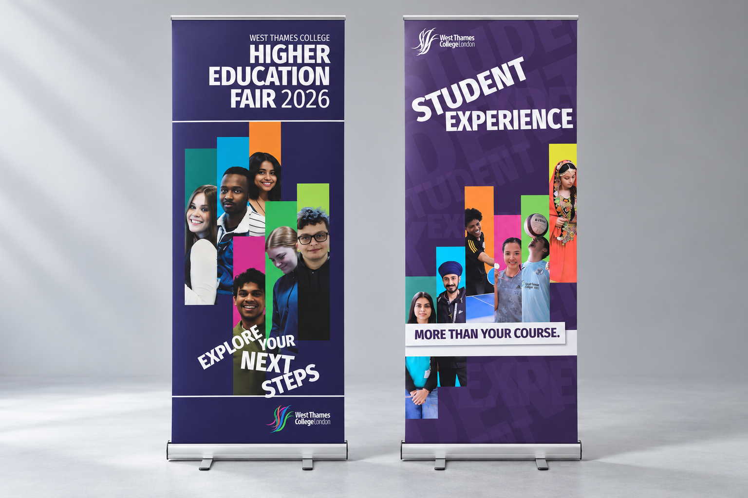
The identity extends into the college environment through digital screens, printed posters, staff profiles and a Student Experience roller banner.
These applications bring the system into everyday student life, giving departmental communications a recognisable presence across both practical information and promotional campaigns.

FROM EVENT CAMPAIGN TO SISTER IDENTITY
The Higher Education Fair established the starting point: bold type, student photography and vertical colour blocks drawn from the college palette.
To develop this into an ongoing departmental identity, I expanded the approach to accommodate a broader range of subjects, content lengths and formats. Shared design principles hold the work together, while flexible layouts and service-specific colour treatments allow the identity to grow.
What began as an event campaign became a lasting visual framework for Student Experience, connecting individual services through a coherent identity within the wider West Thames College brand.